

Caravan Sandwitch was one of my absolute favourite games of 2024. I've said a lot of nice things about its sandbox design, its writing, the music, the scope, but today I want to talk about one thing in particular, because that's what this feature is about: its art.
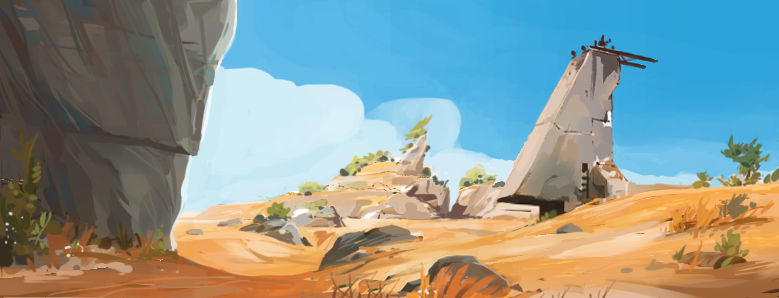
With a relatively limited budget and small team, some smart art design decisions and faultless inspiration means I remember Sandwitch as fondly for its looks as I do games with 100x the budget. It had such a breezy vibe, one that was perfectly in keeping with the game's familial tone and seaside setting.
Because I loved it so much, and because I haven't run one of these posts for a while, I figured there was no better subject for a Showcase blog than Charles Boury, who served as Art Director on the project.
Luke Plunkett: Hey Charles, thanks for chatting with us! What was your experience working on the game? Did you think it would resonate with a global audience the way it has?
Charles Boury: I was very much involved since early production to final release, for nearly three years. It’s the longest I’ve worked on a game. I was grateful of the absolute trust the team gave me for setting an art style and developing a world. Giving life to the story and the world of Cigalo was awesome. Every game dev story has highs and lows, and we had big lows for sure. I had moments of desperate doubts. It was hard. But we hanged on. For me, the early pitch was so important that I think it was worth it.
We aimed to create something more gentle and diverse, you know, that’s why it resonated strongly with players around the world. Everyone in the team wanted to deviate from the common open world, where you slash, extract and conquer. We were tired of seeing humans portrayed as inherently bad, and nature as a resource. We wanted to be optimistic for the future, spark an aspiration to live in communities, and deal with conflicts without violence.
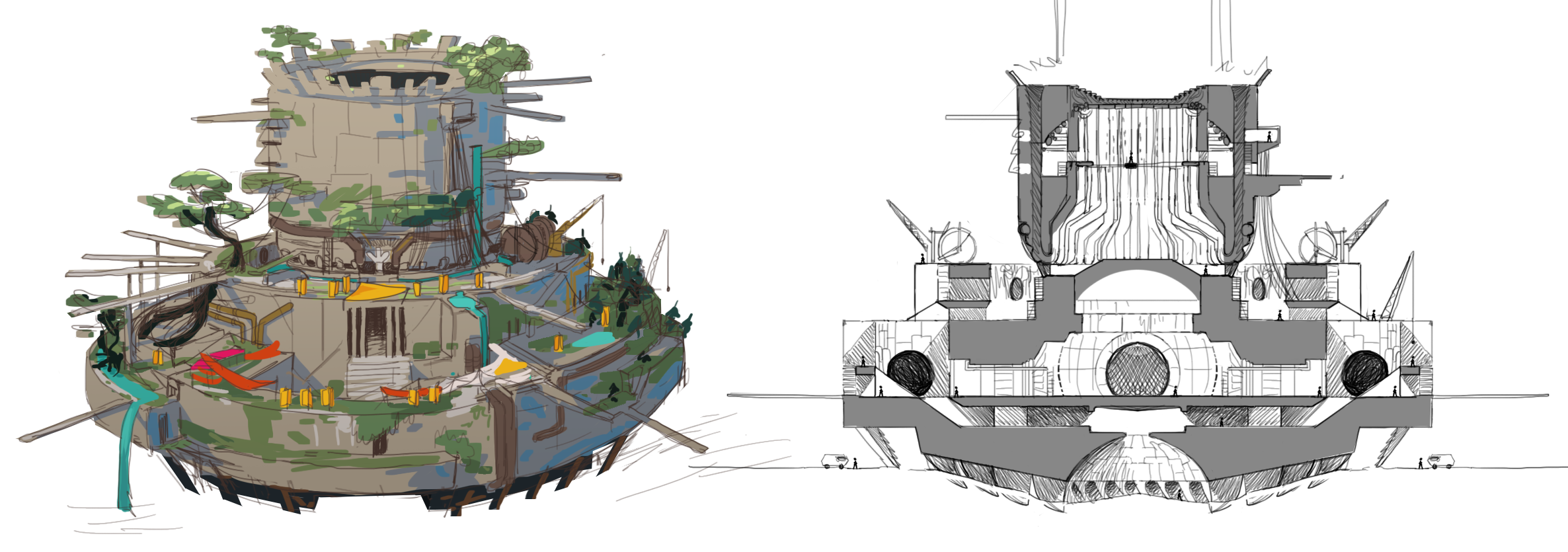
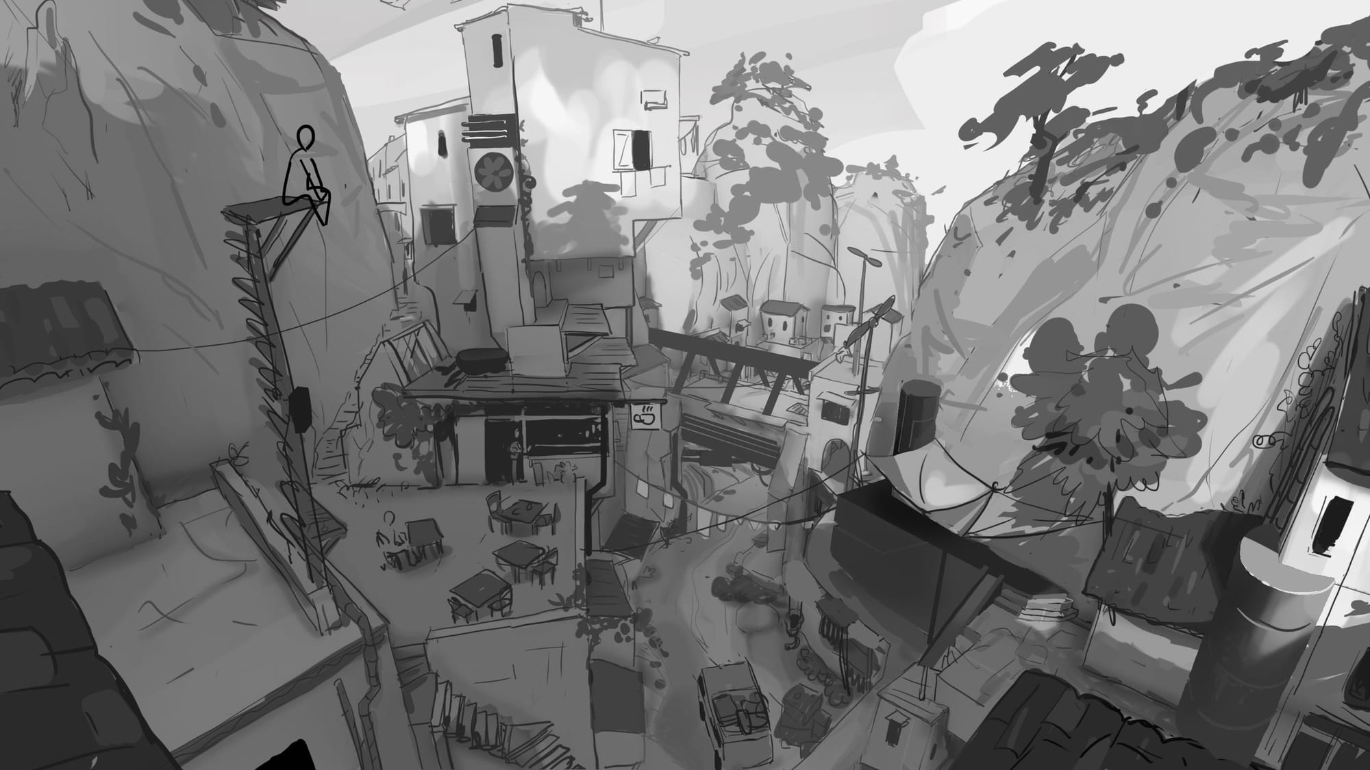
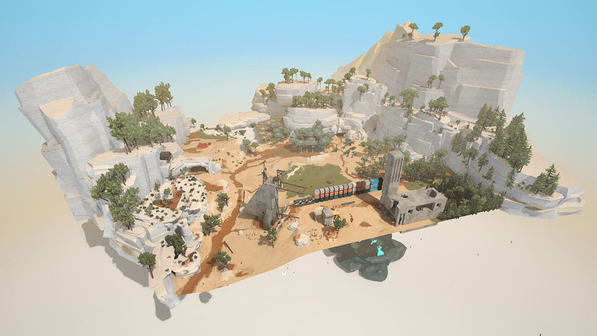
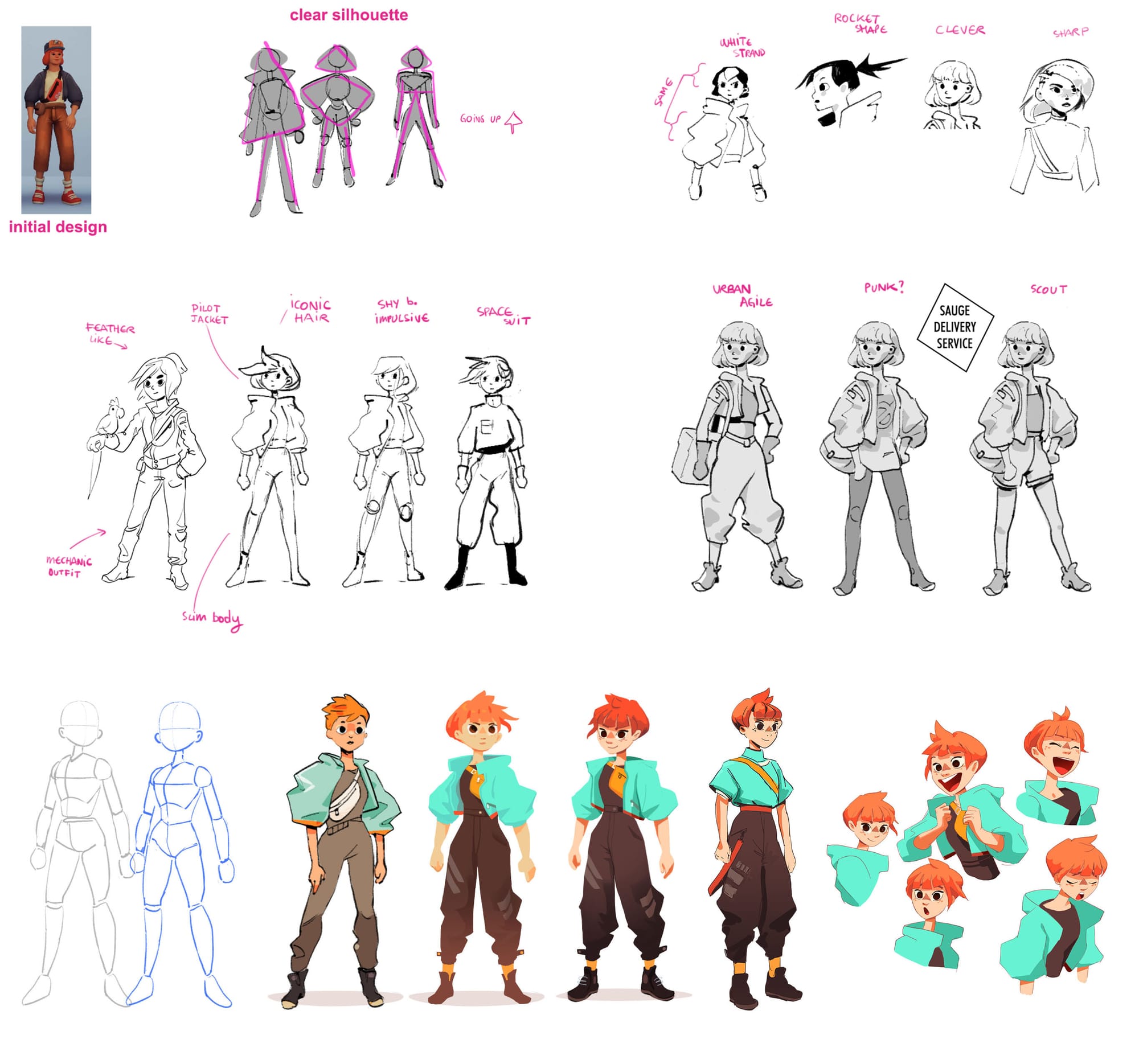
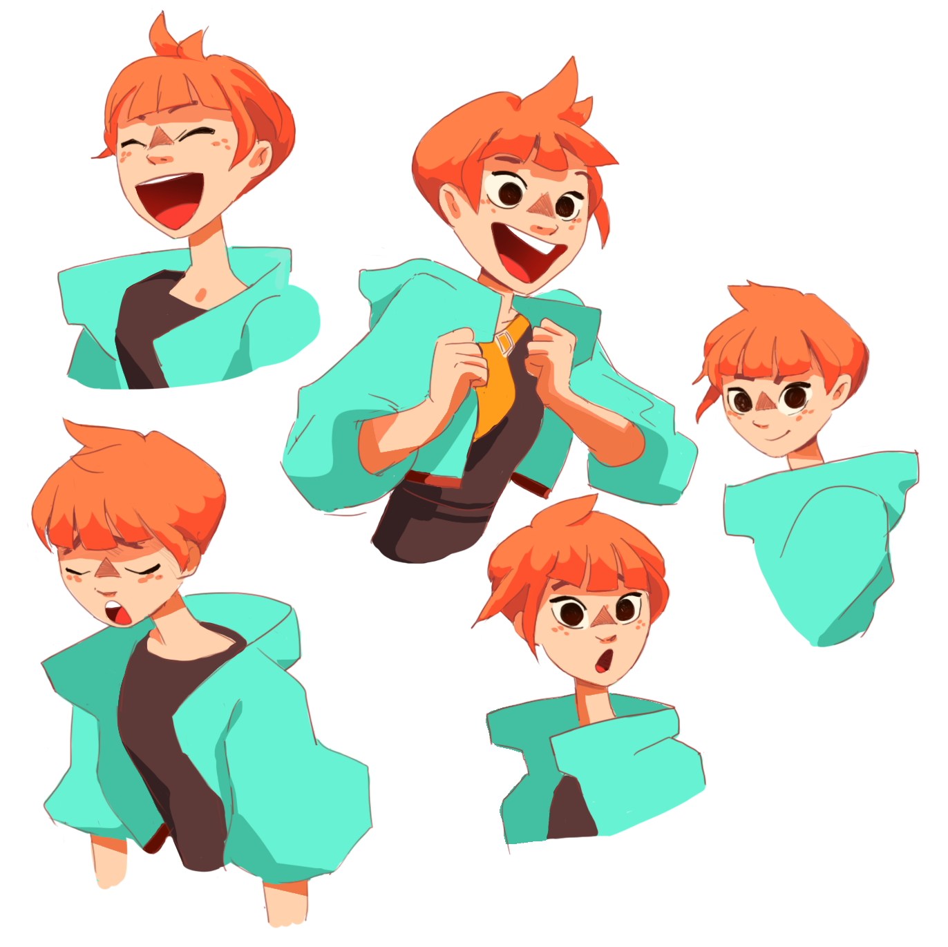
As an art director, my role was to transcribe these intentions in visuals. But I think my most useful contribution to this project was to come up with a way to create a small open-world with a tiny team of 3 artists, with an easy-to-scale style that is still appealing.
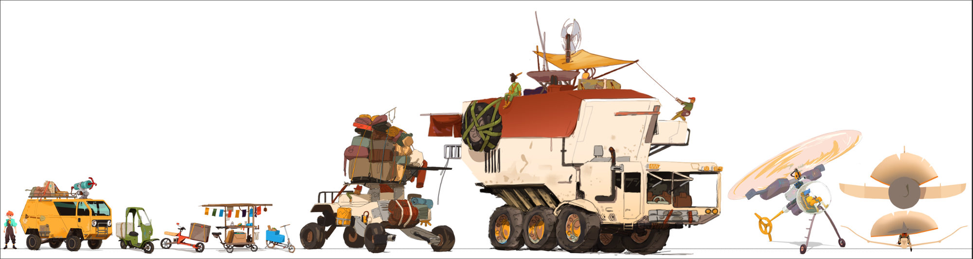
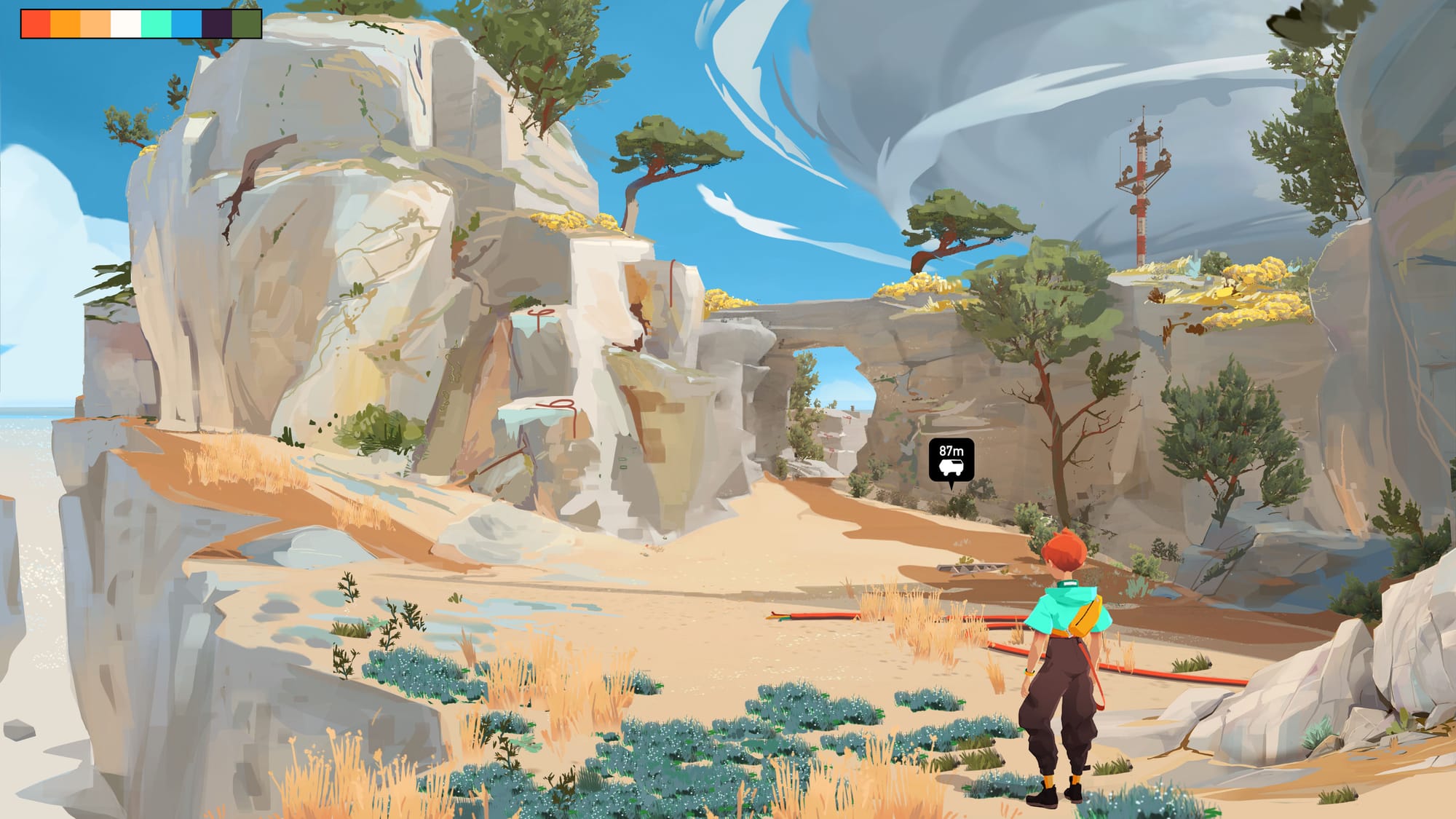
But to be frank, I didn’t expected the game to go so well. It may be because of the queerness of its cast and plot, filling a need of representation, or the proud political stances our Creative Director Emi took on socials. Few games and studios are promoting diversity and anti-capitalism. But is this the only reason why people are drawn to this game? I believe its joyful visuals and soothing gameplay create the initial spark. Why the trailer did so well? Is it the vivid but smooth color palette, or the Mediterranean vibe? Or is it the yellow van? I really don’t know, but I think it’s a coherent artistic statement.
LP: I mentioned what I thought were some of the game's visual inspirations in my piece about Caravan Sandwitch, especially Wind Waker, but what were some of the actual influences for your work on the game?
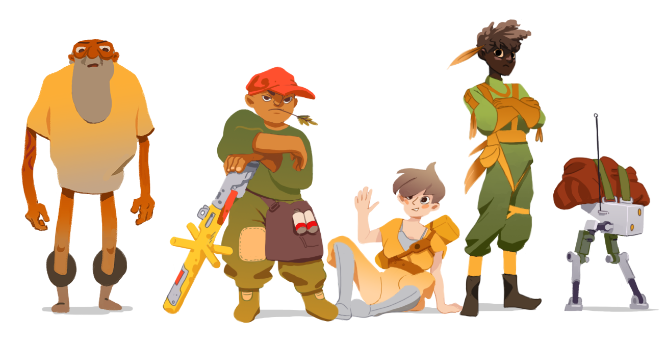
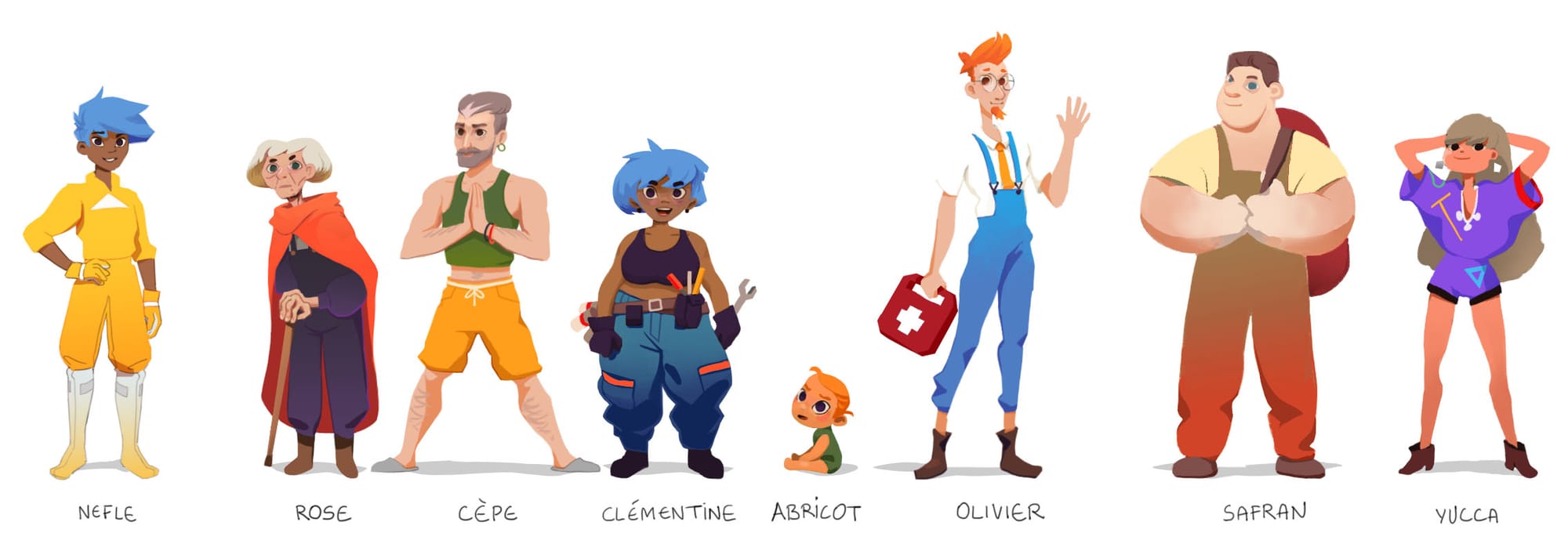
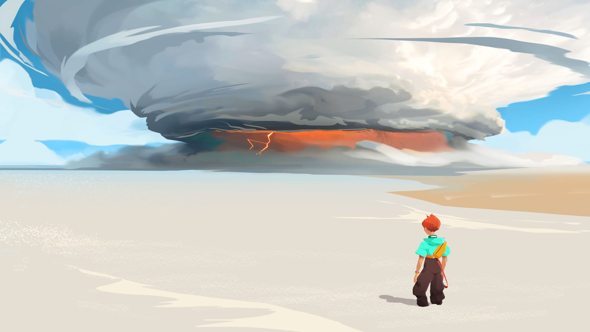
CB: Nausicaa was a big inspiration, visually and politically. The other main influence is the illustrative work of Simon Stålenhag. Then there are more specific refs, like the character eyes of The Wind Waker, the dunes of Journey, the music of Sable, and many more.
Formally, the visual of our game lean slightly on a “Ghibli aesthetic”: characters with big eyes, solid, vibrant colors, and recurring tropes like a young female as a protagonist. But we tried to be more faithful of our inspirations than a simple formal resemblance. We aimed to give a playable experience true to the values we loved in Ghibli movies. So: everyday-life, pastoral aesthetics, humane issues, the trope of a trusty vehicle (the glider of Nausicaa, the plane of Porco Rosso, Kiki’s broom…). Also, we are aware of what games are: trendy, mass-media leisure hobbies delivering power fantasies to rich people. It doesn’t align with the values portrayed by the story. But like Ghibli studio, we decided to use a seductive media to deliver our message to a wide audience, make an exploration open-world game while pulling away from its usual shortcomings.
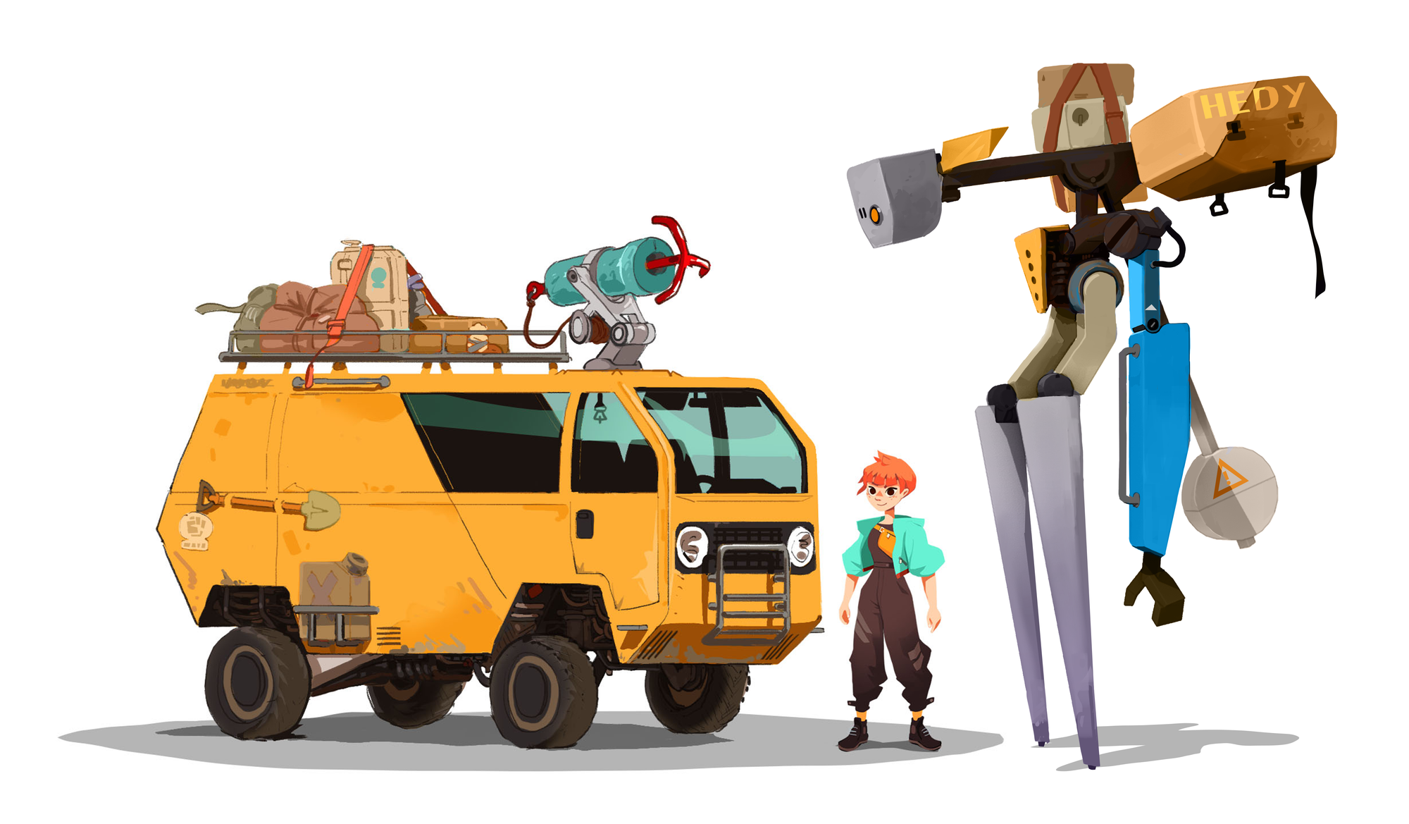
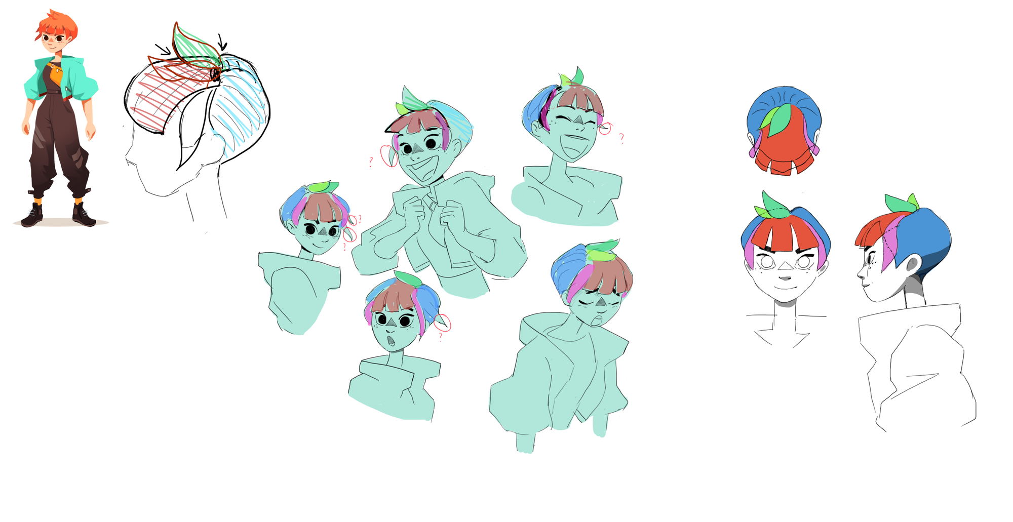
LP: I saw on your site you mention techwear as an influence in some of the game's costume designs. [Willem Dafoe voice] As something of a techwear guy myself, were there any brands or pieces you drew on specifically for the characters?
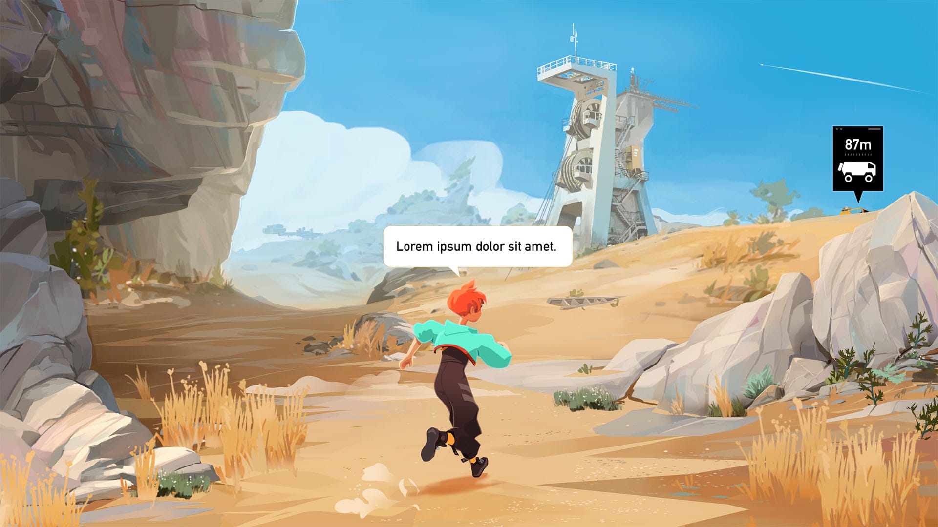
CB: I’m sorry to disappoint you, but I don’t know any techwear brand! I didn’t do acute researches and only skimmed the net for a few cool refs, without knowing any specifics about the trend. So a simple combination of high waist pants, straps, a bomber jacket and a waist bag. I hope I didn’t miss the spirit of techwear while designing the protagonist's clothes.
This style was chosen as a way to hint at her ability to parkour, and reveal the dichotomy between her situation, coming from an urban and high-tech environment, and the other characters, living in a lonely village.
If you want to see more of Charles' stuff, you can check out more of his art (and comments on projects he's worked on) at his personal site.

'Showcase' is a feature highlighting the work of artists in and around the video game industry. You can see more, for stuff like Homeworld 3, Blue Eye Samurai and beyond, here:


