

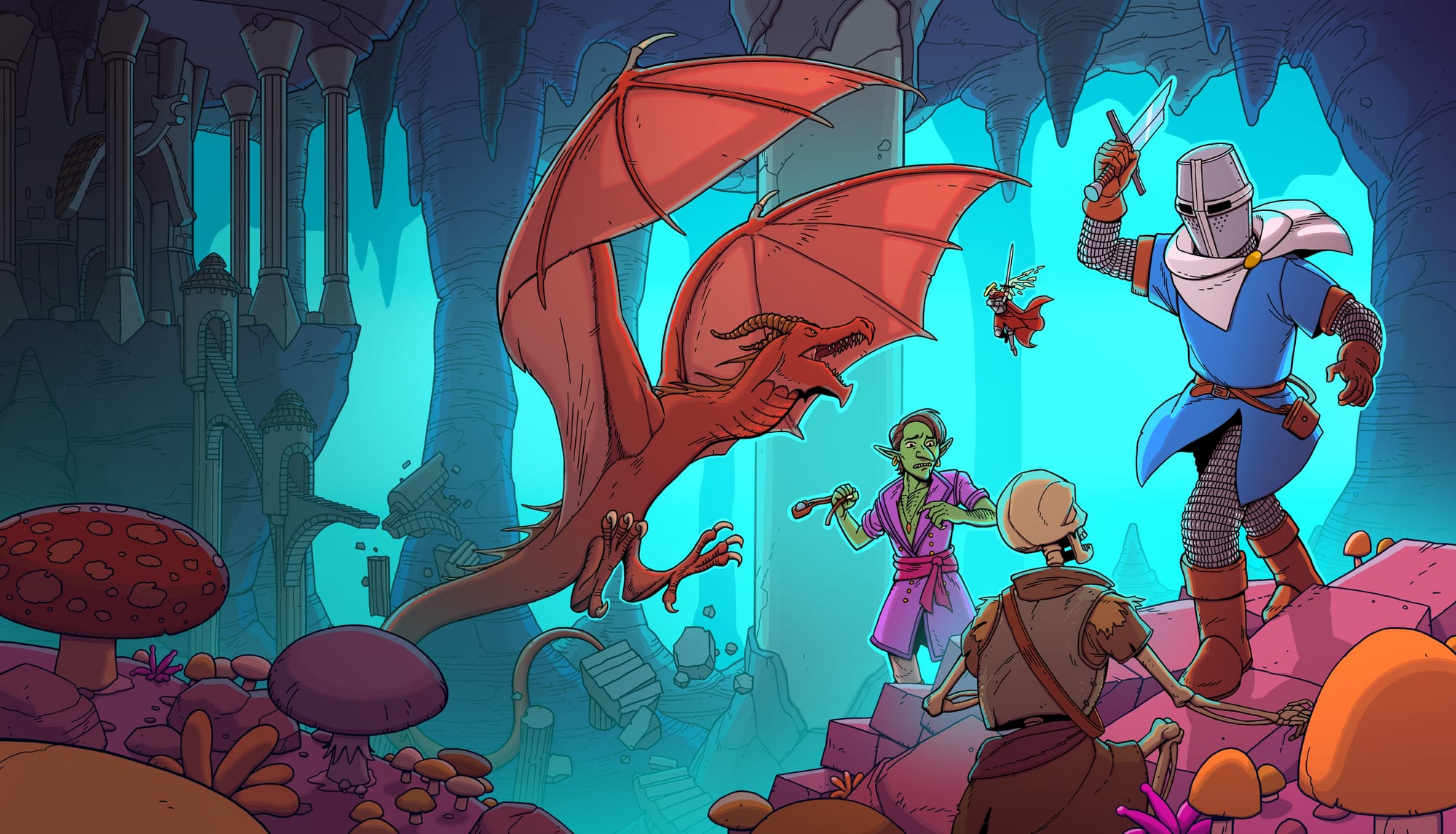
I am madly in love with Esoteric Ebb, for all kinds of reasons (the writing! the world!), but the thing that just keeps slapping me in the face, every time I enter a room or run across a courtyard, is how good it all looks.
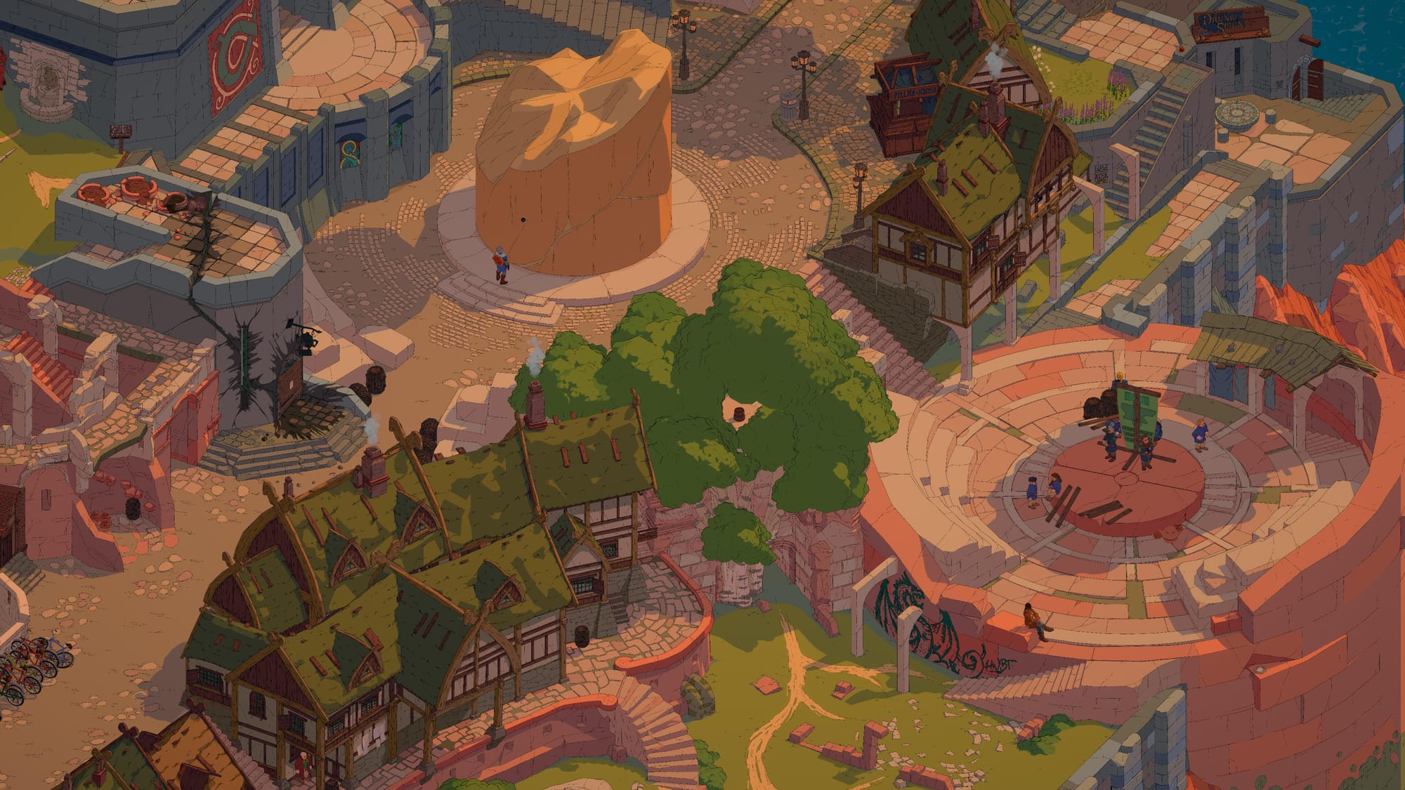
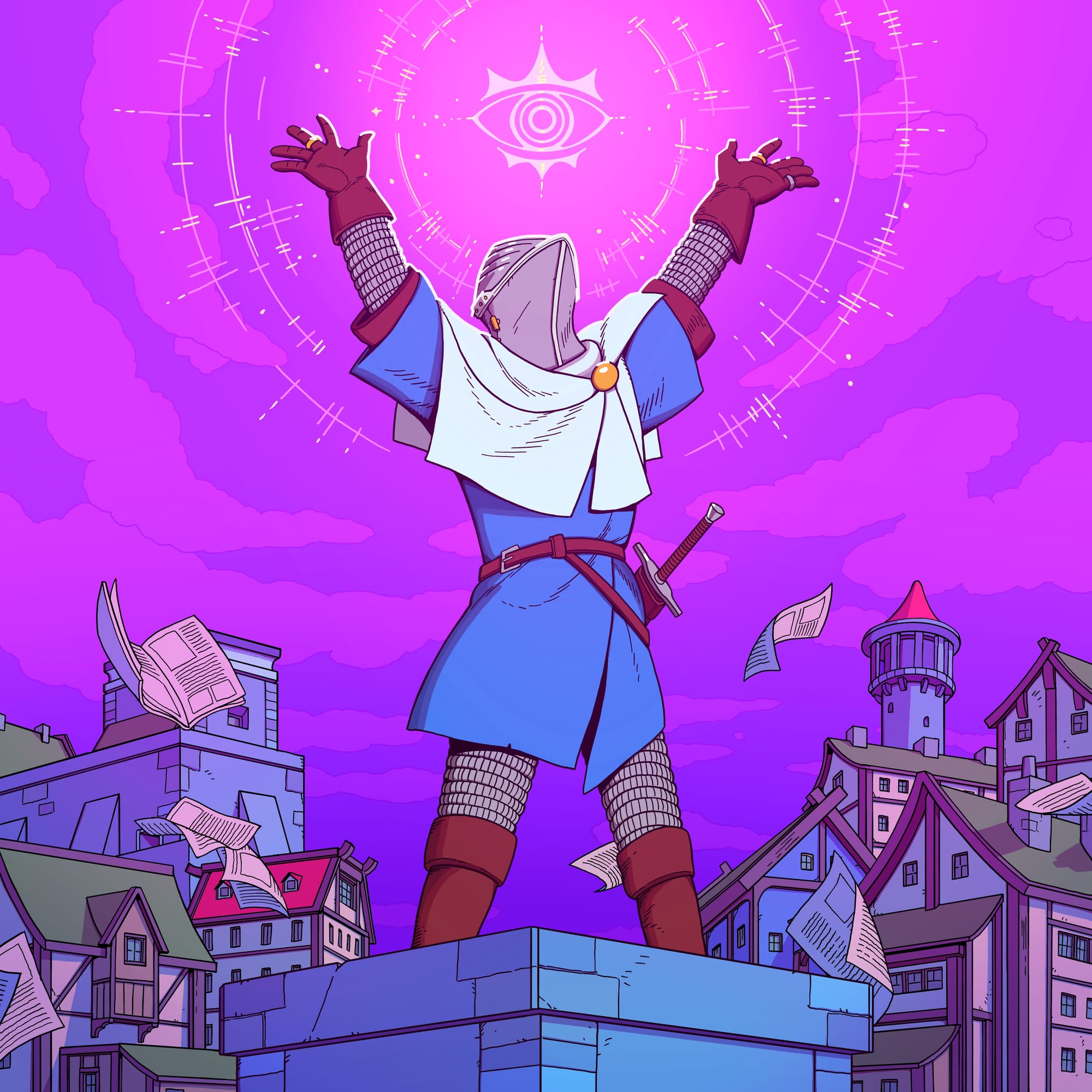
This is a beautiful video game. And it's beautiful in such an understated, impressive way; there's no shock and awe here, no blinding effects or dazzling lighting. You just play the game for a few hours then slowly realise that Esoteric Ebb is a triumph of design, a game absolutely crammed with the work of good artists doing cool and economical stuff.
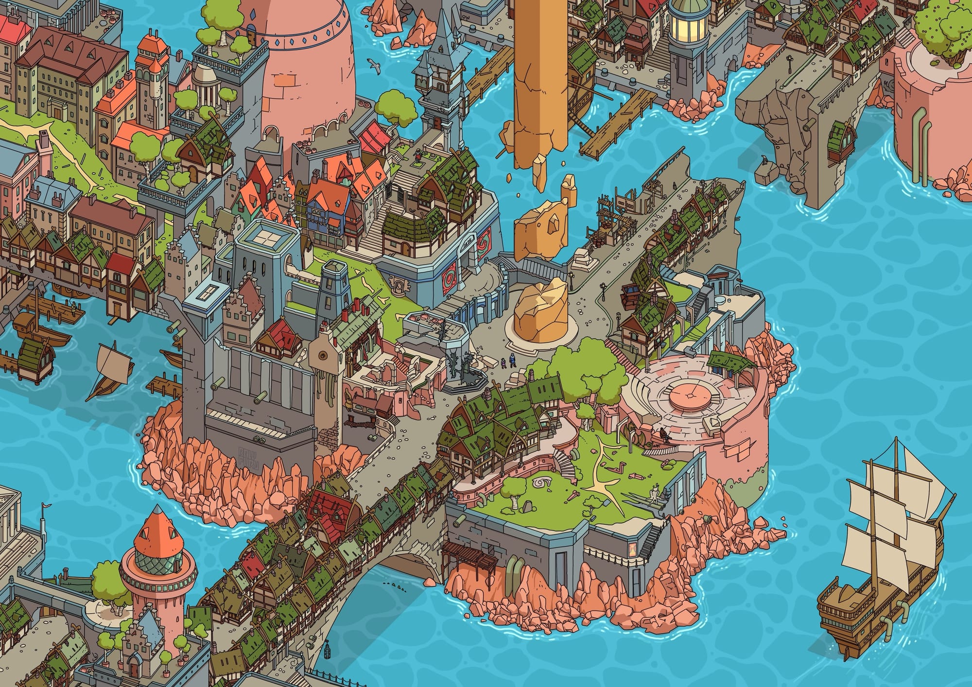
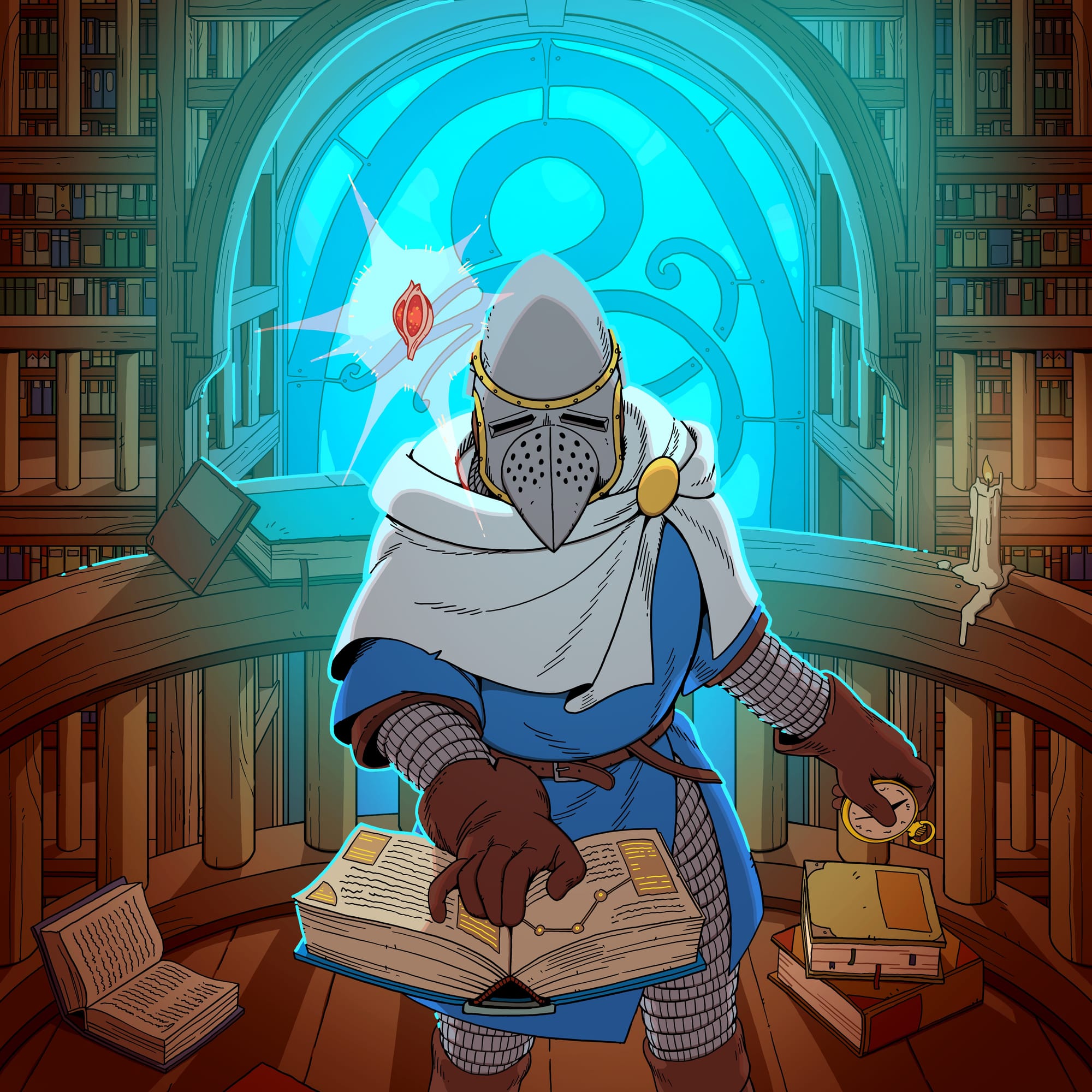
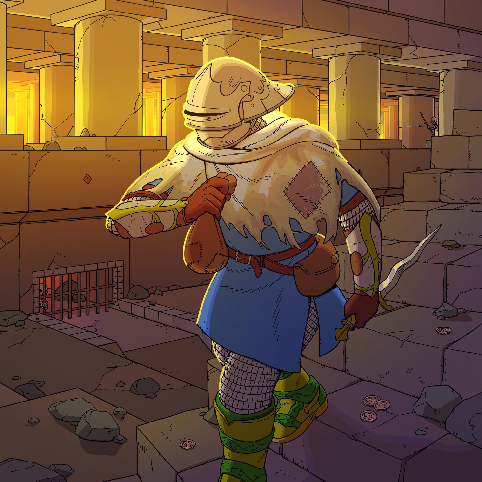
The character illustrations are great, the world is somehow both a hark back to 90s RPGs while also looking crisp and modern, and the map is one of the best I've ever seen in a video game. I could go on and on, but seeing as I love it all so much, and run a semi-regular feature looking at the art of video games, I figured it'd be more useful for all of you to have the artists do some talking instead.
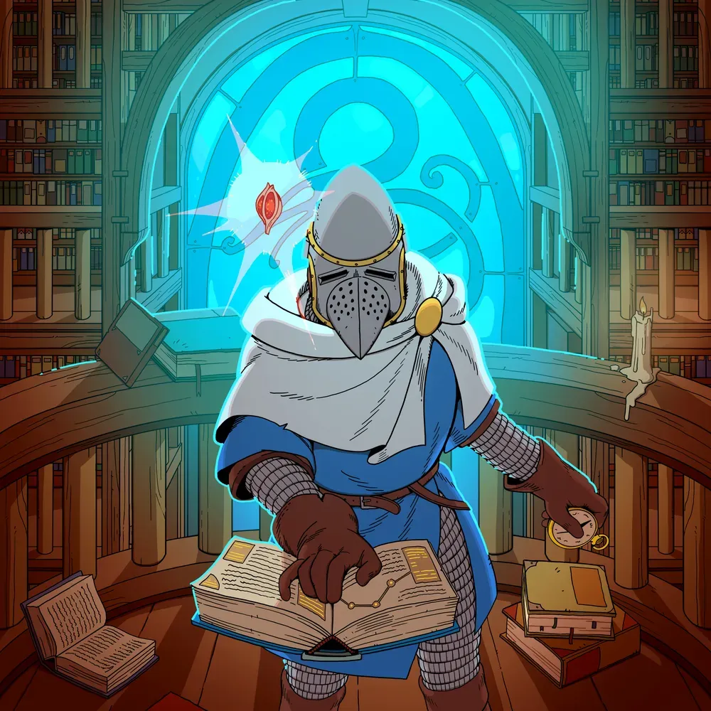
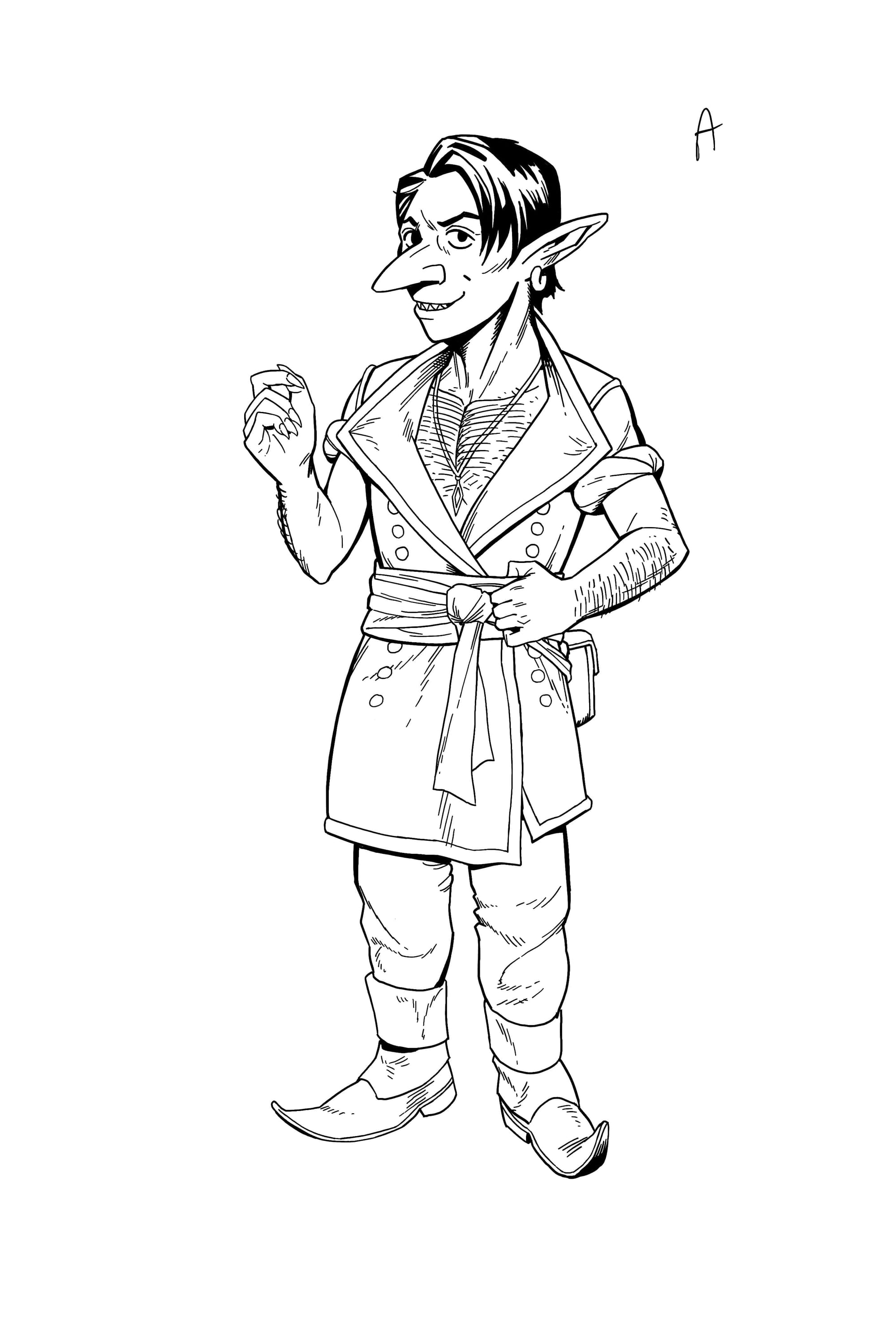
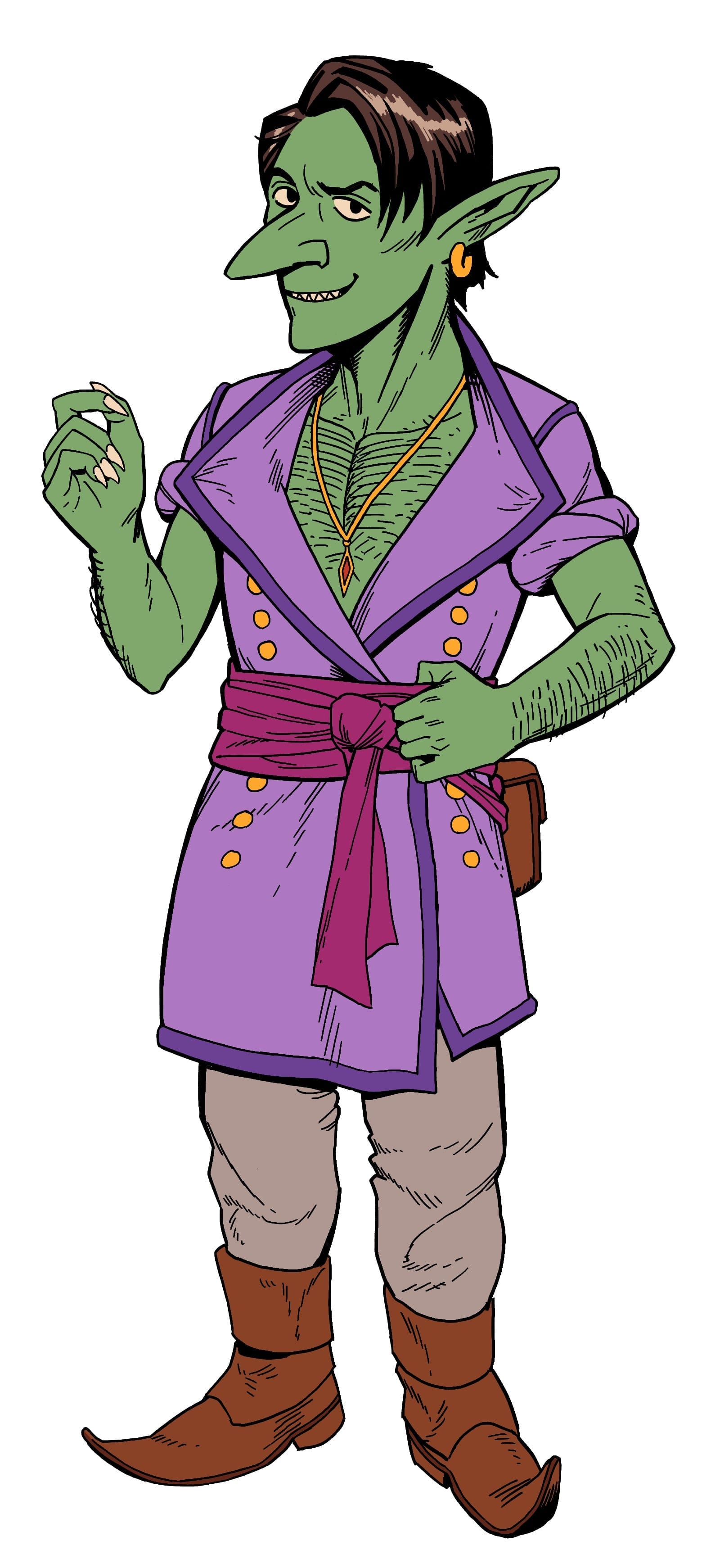
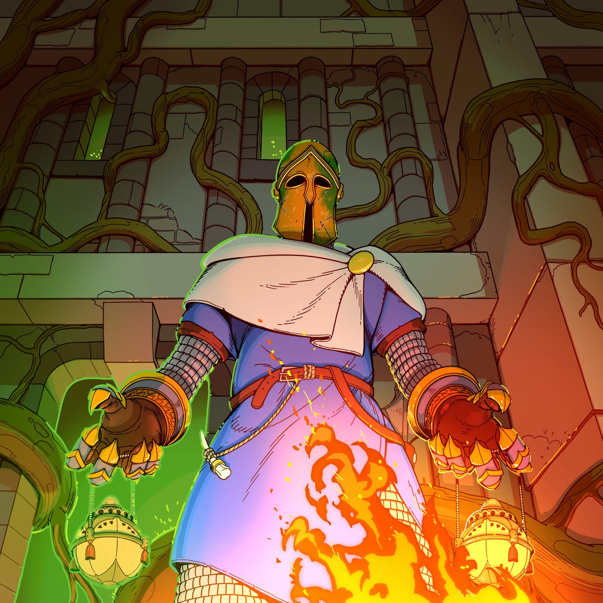
Oscar Westberg did a lot on this game, from character design to character art to the icons and illustrations of your equipment. "When [creator] Christoffer [Bodegård] approached me, he had already done quite a bit of work on the game himself", Westberg says. "His mood board for the game’s visuals included a couple of artists working with line art and colour, including many of my drawings! So my personal style was a natural evolution of what Christoffer had already done. My first work for Esoteric Ebb was a character drawing, which I did in my style, and Christoffer felt that it was perfect for the game."
"When we worked on character designs he’d give me a description of the character; personality, job, species etc. Other than that I often had quite free rein to come up with a design. I’d do several ideas and iterations which we’d discuss together. The same was true for items in the game, though Gibbet Games came up with a couple of ideas too. Before starting to work on Esoteric Ebb, I had created and published a book on fantasy items, and later an illustrated journal-style fantasy adventure book. Both of these circulated around the team as stylistic inspiration as well."
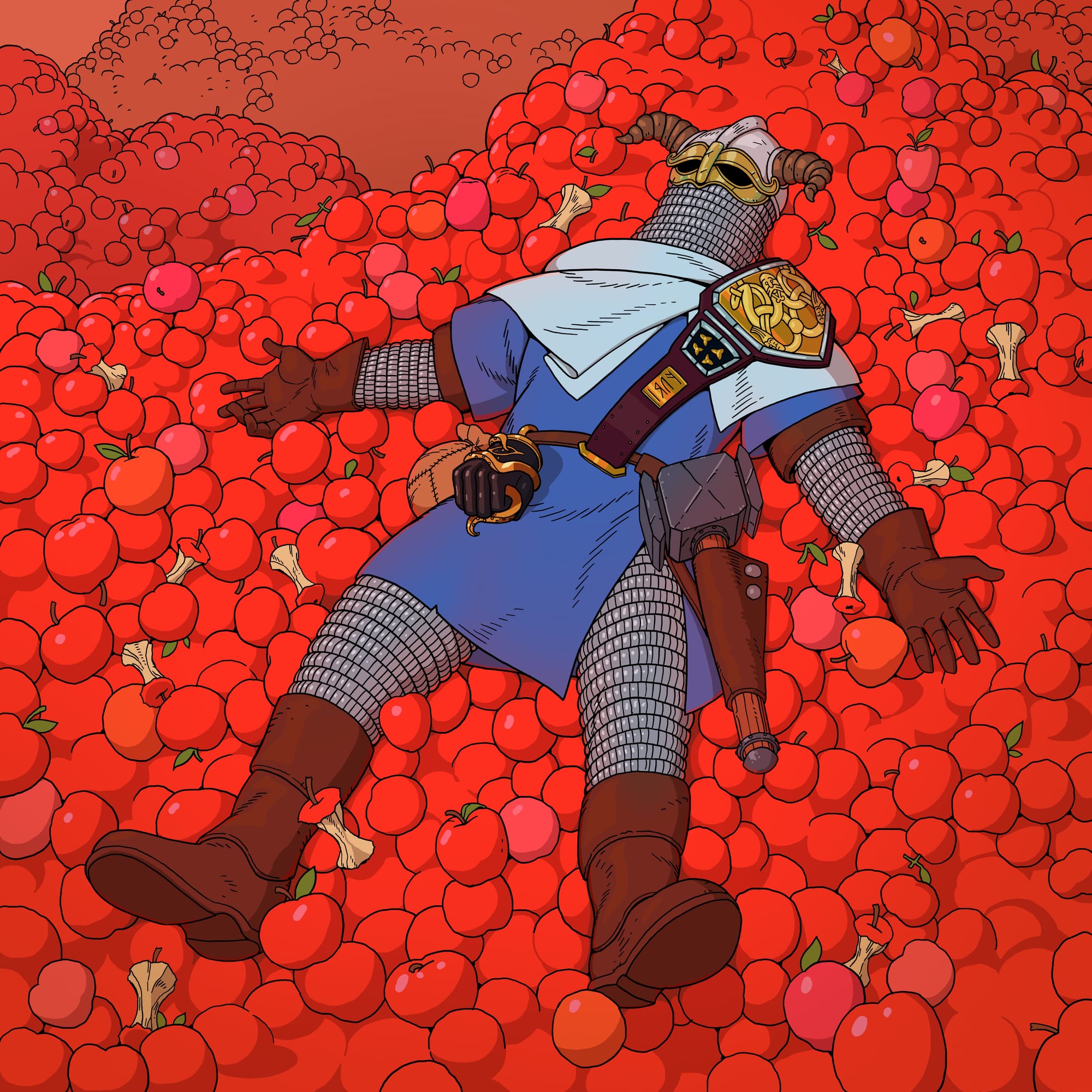
These zoomed-out screenshots really emphasise the game's limited, but now recognisable, colour palette
"In terms of visual style, I’ve been inspired a lot by comics and manga I grew up reading", Westberg says. "Such as Tintin, Moebius, Naruto and Akira. And for design I’ve looked at museum photographs of historical armor and relics, and fantasy live action role-play events. I really enjoy making designs that would make sense and be comfortable to use. I mix different real-world armor parts and clothes to create something functional, but that still looks new, fantastical and cool."
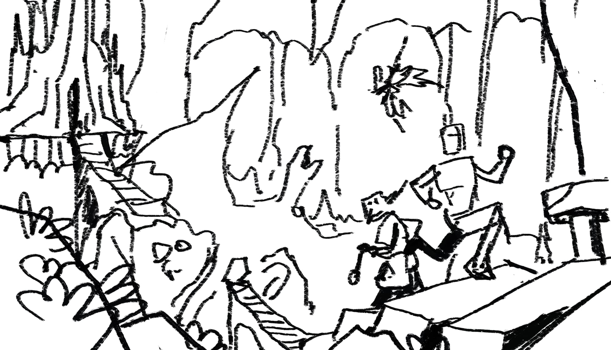
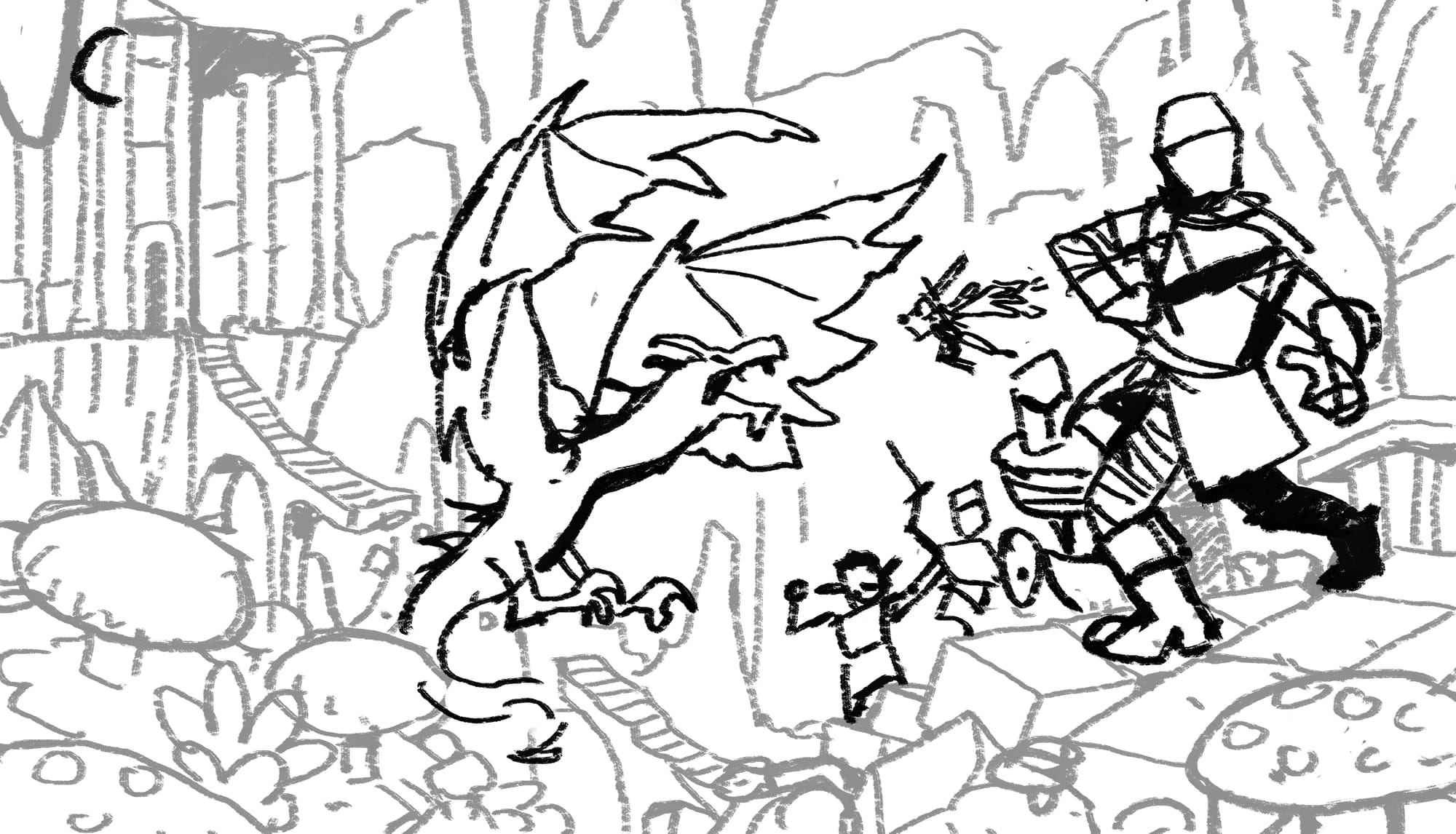
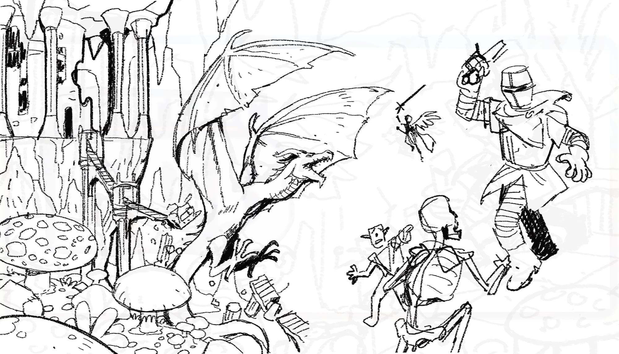
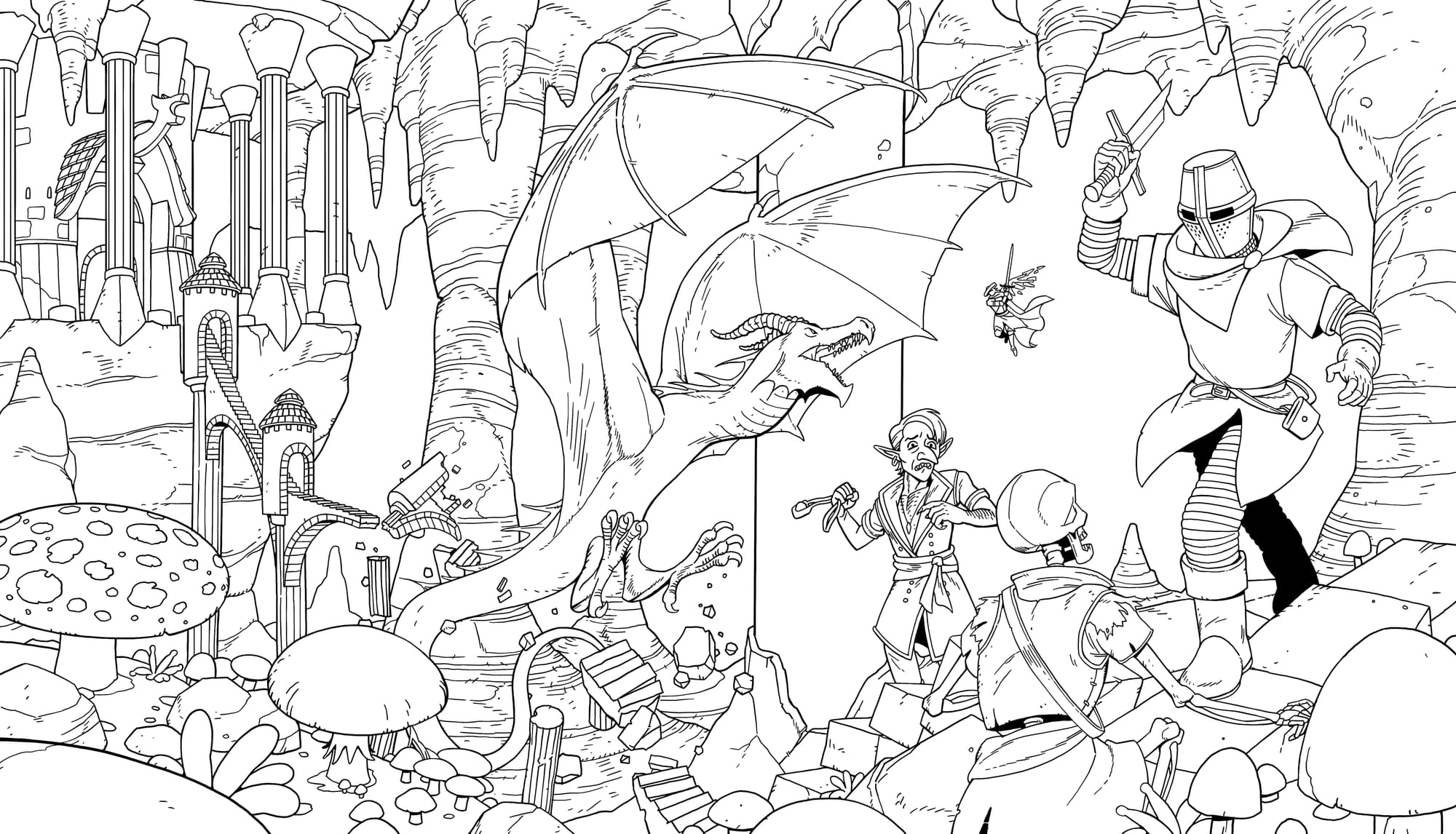
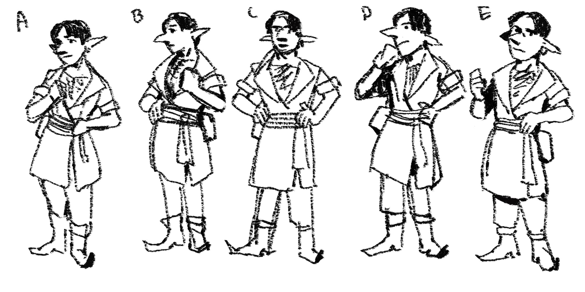
These sketches show the progression of Westberg's key art for the game, from the roughest of outlines to the finished piece
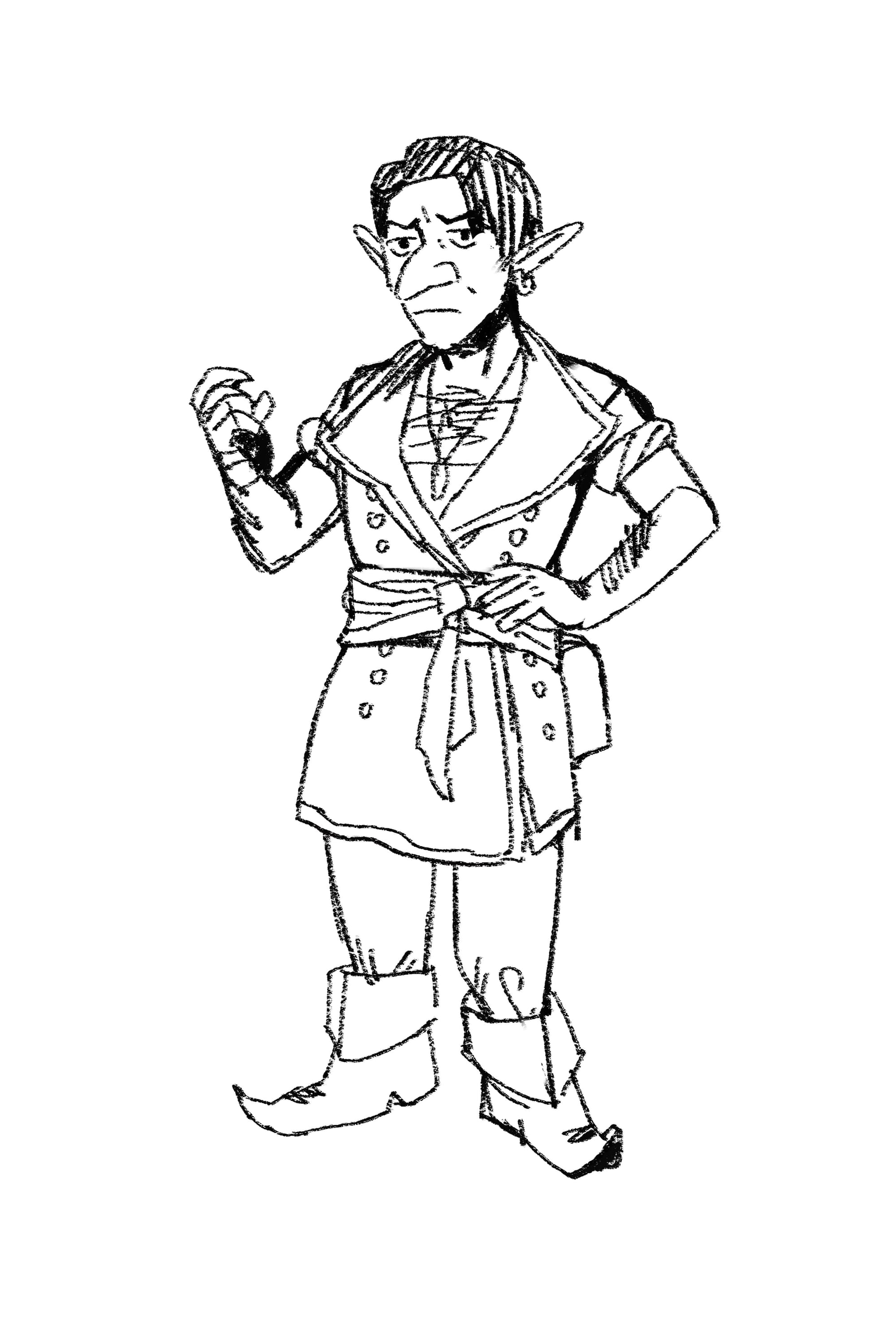
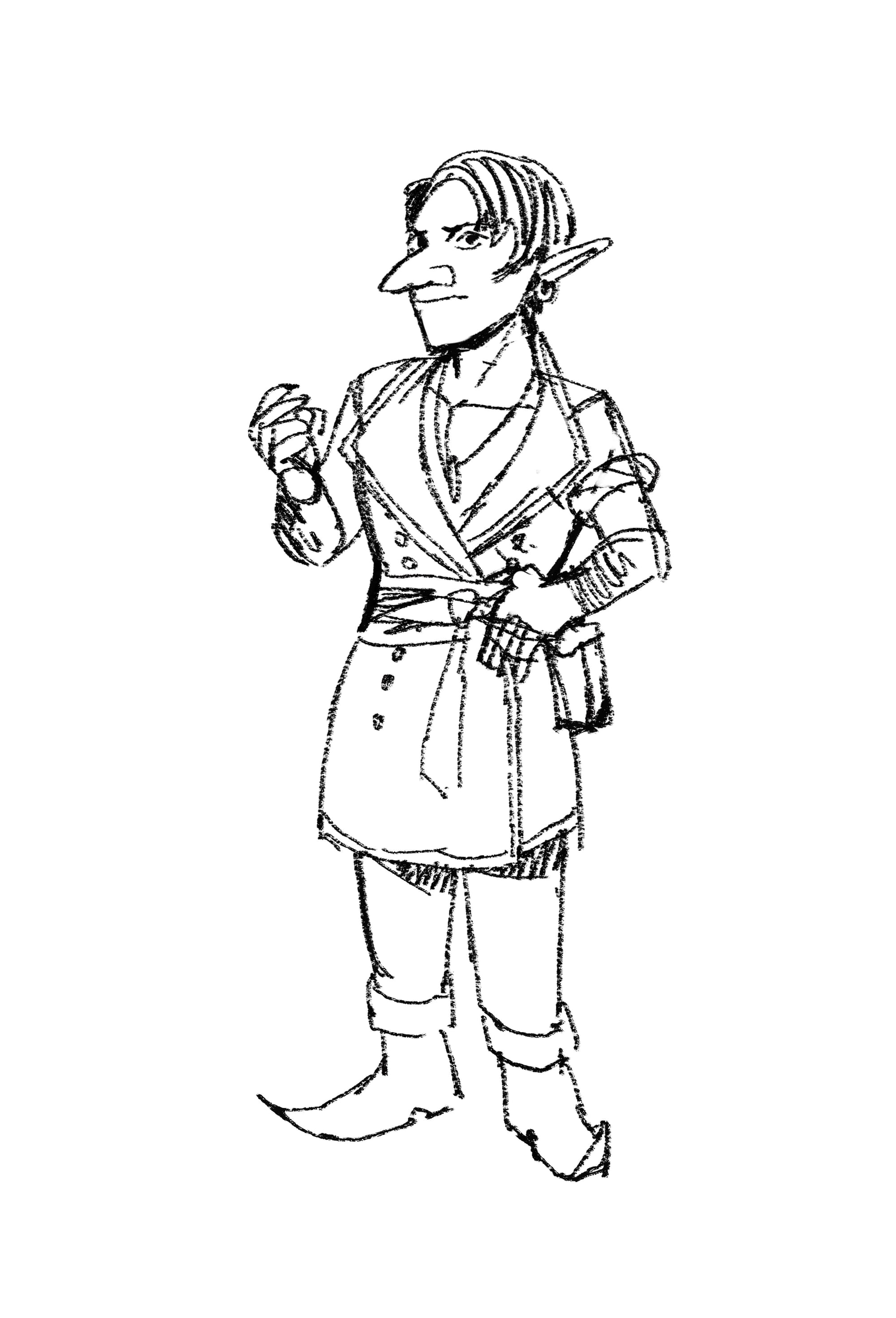
The development of Snell, from outlines through to the final illustration you see in the game
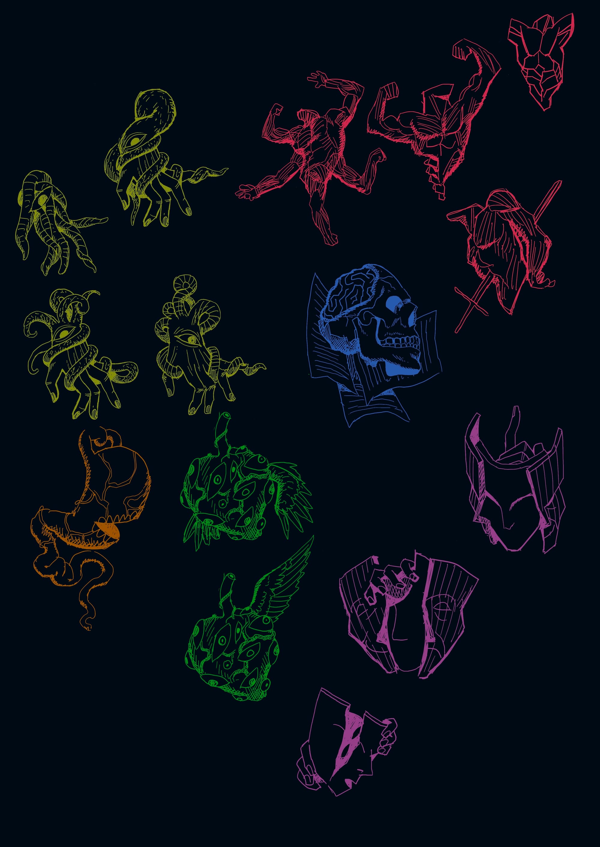
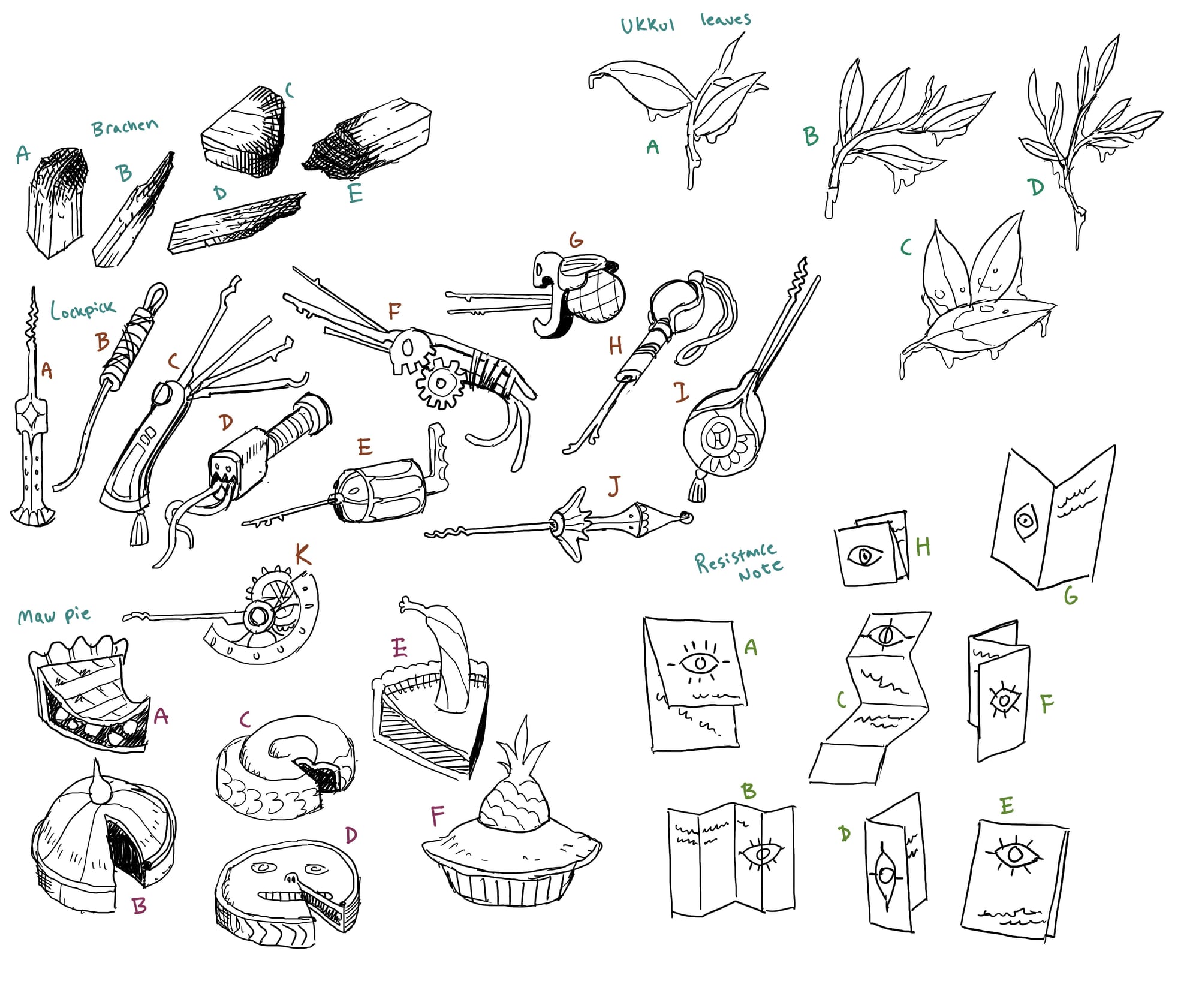
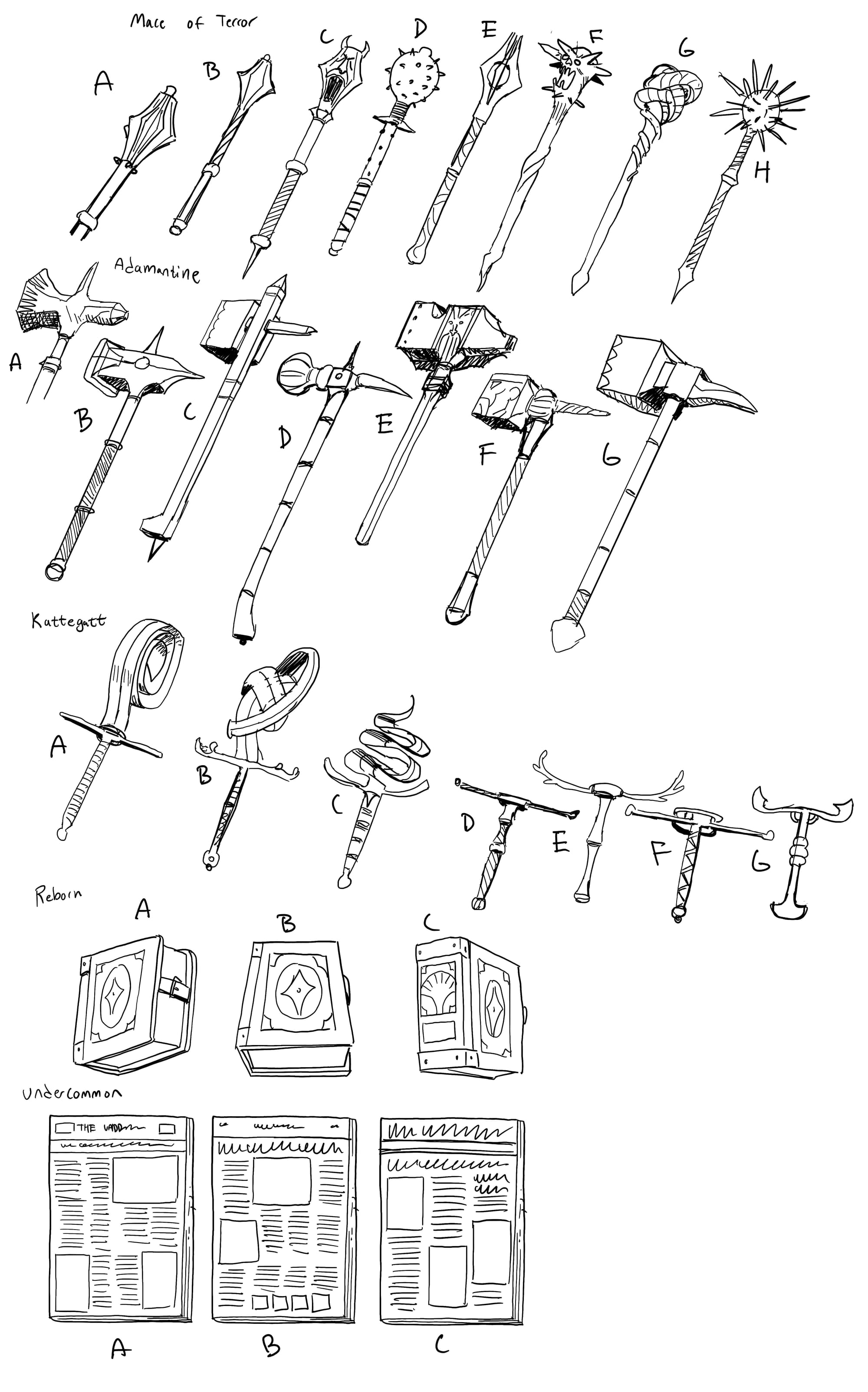
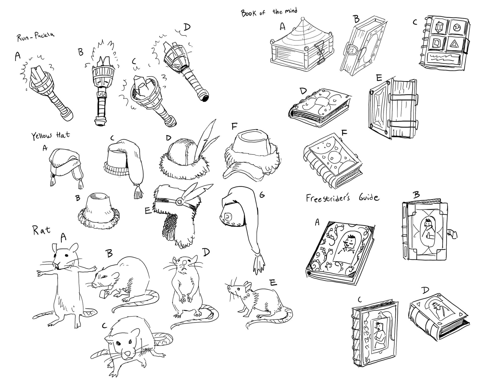
Just a small selection of sketches for the game's collection of items, weapons and other bits of junk
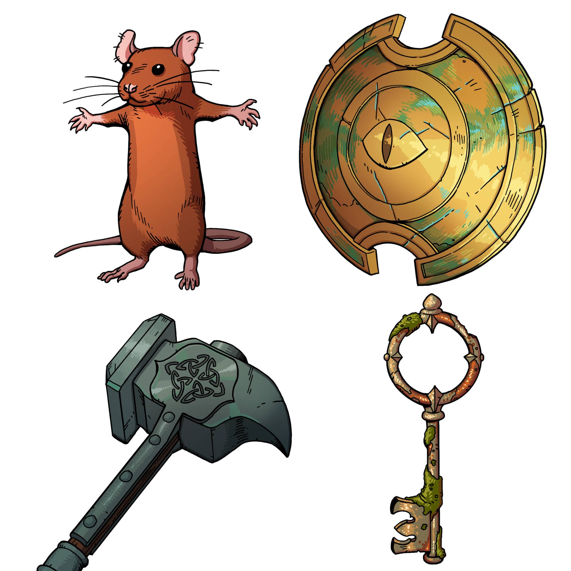
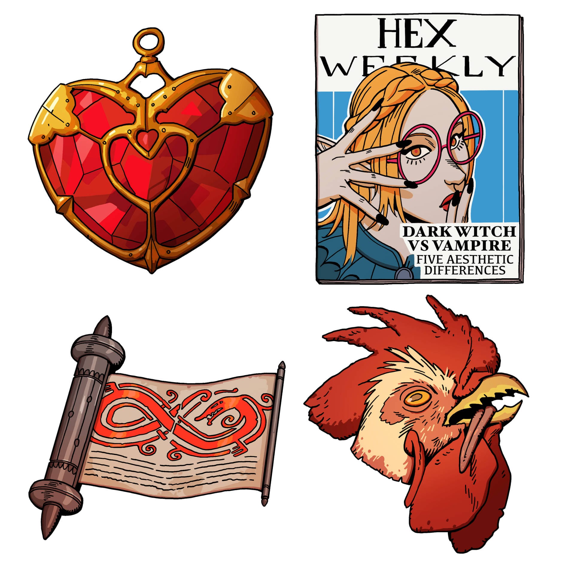
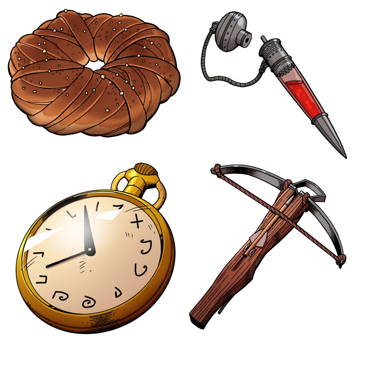
Some of the final, in-game illustrations done for inventory items
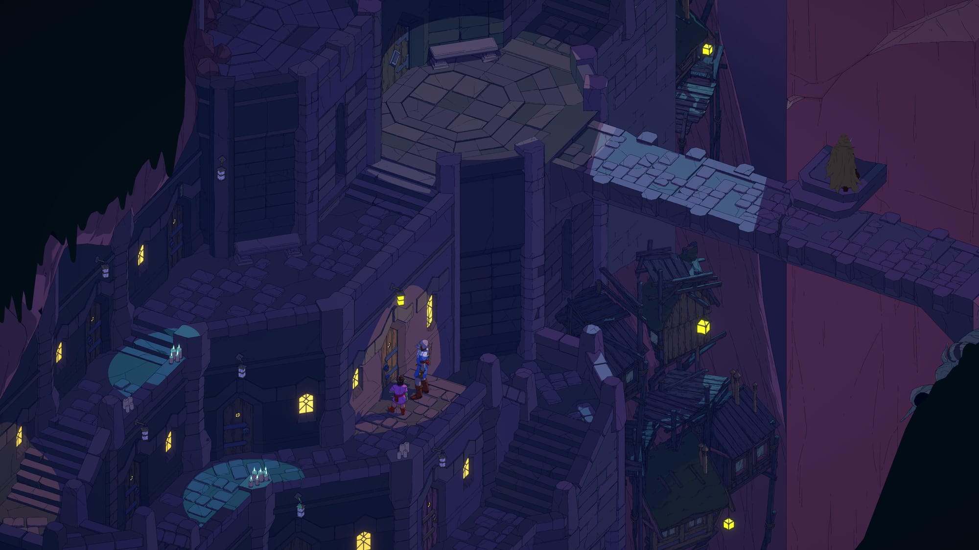
While Westberg was responsible for much of the game's character and illustration work, a huge part of Esoteric Ebb's visuals--like its 3D models and environments--were handled by Gibbett Games (full credit list here).
"Most of the time we got blockout areas that were mostly very simple, with just an idea for the area" Gibbett's Jonathan Nilsson tells Aftermath. "Then we started to work on the area, and Chris would tell us some of the lore for each place. But when we added stuff or made changes he would also make changes in the game (and the lore) so it was a really fun and creative project."
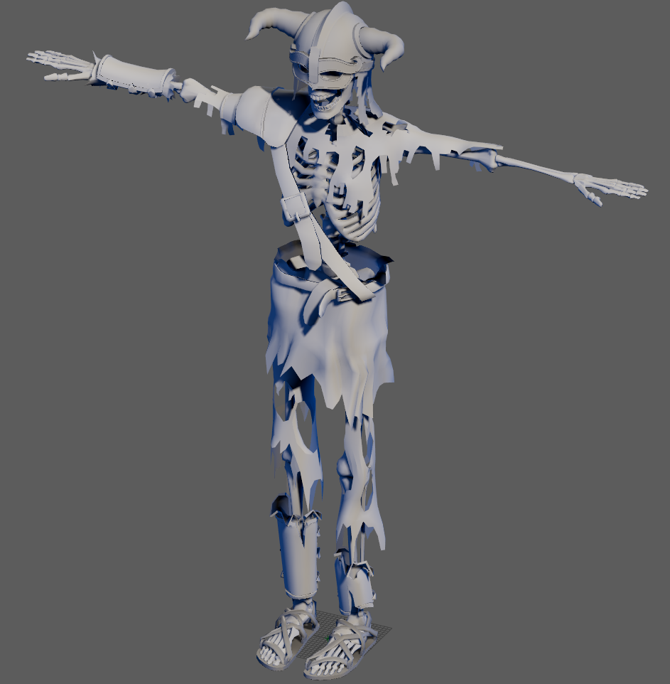
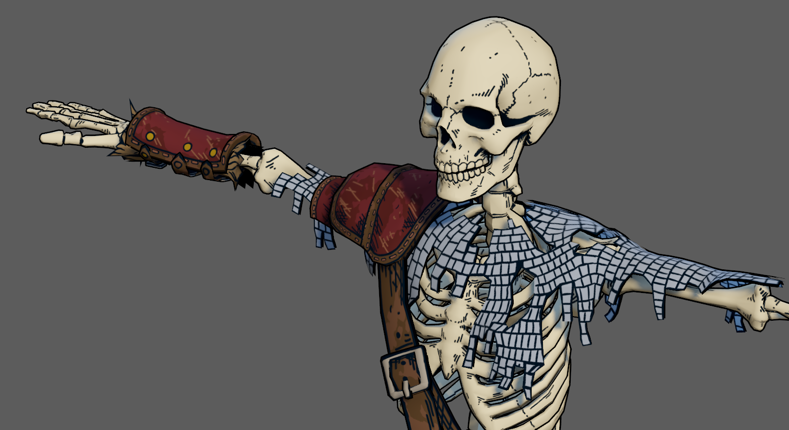
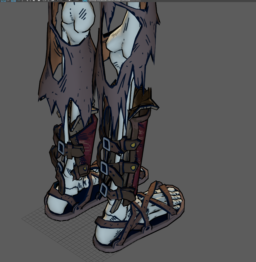
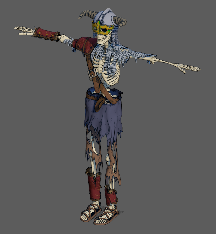
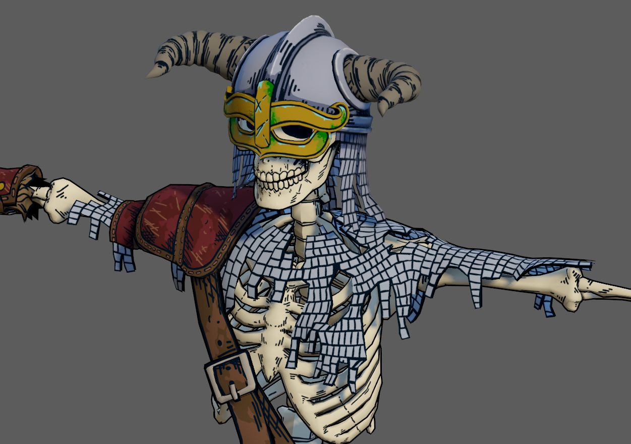
From an untextured model Gibbett had to dress every character in the game to match Westberg's illustrations and designs
"Instead of having a very rigid idea, he was really open for new ideas and also incorporated the new ideas in the game", Nilsson adds. "In these videos you will see the process of the creation of the game's areas, from the blockout to final version."
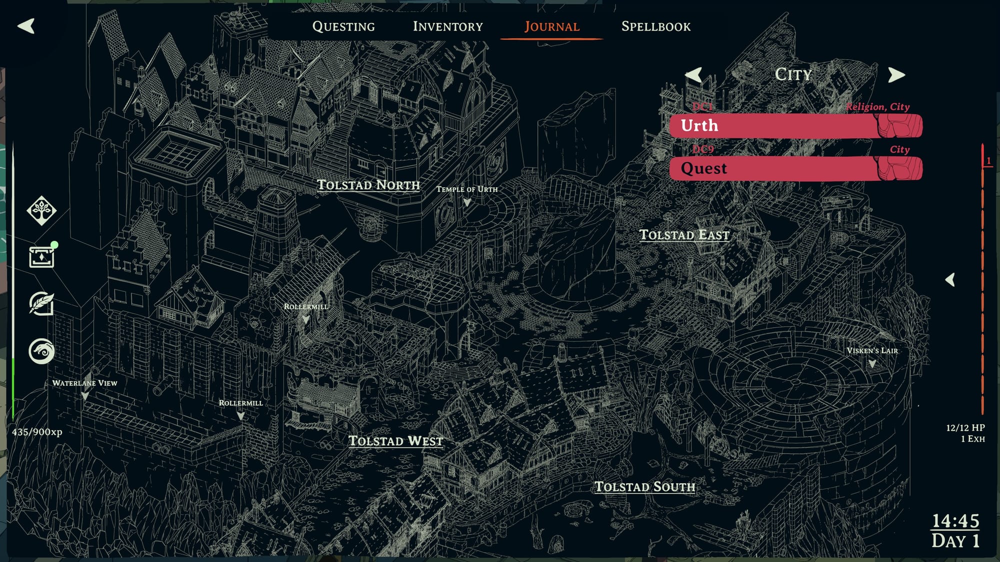
Maybe my favourite part of the whole game, though, is the map screen. It's not a fancy map; it doesn't rotate or give you precise directions. It's just a regular map that you can look at, work out where you are and try to get your bearings from there. But it's a gorgeous map, and something that just kinda happened.
"The in-game journal maps were something that was added in the last month or so of the project", Nilsson says. "Chris took the line art we did and inverted it to create the maps. It looked really cool, but it wasn't something we planned for when we started."

'Showcase' is a feature highlighting the work of artists in and around the video game industry. You can see more, for stuff like Homeworld 3, Blue Eye Samurai and beyond, here:


