Like the hardware itself, the Switch 2's interface looks a lot like its predecessors. Which, fine, Nintendo can be glacial when it comes to changing this stuff, but that doesn't mean there isn't room for improvement (or just new ideas!).
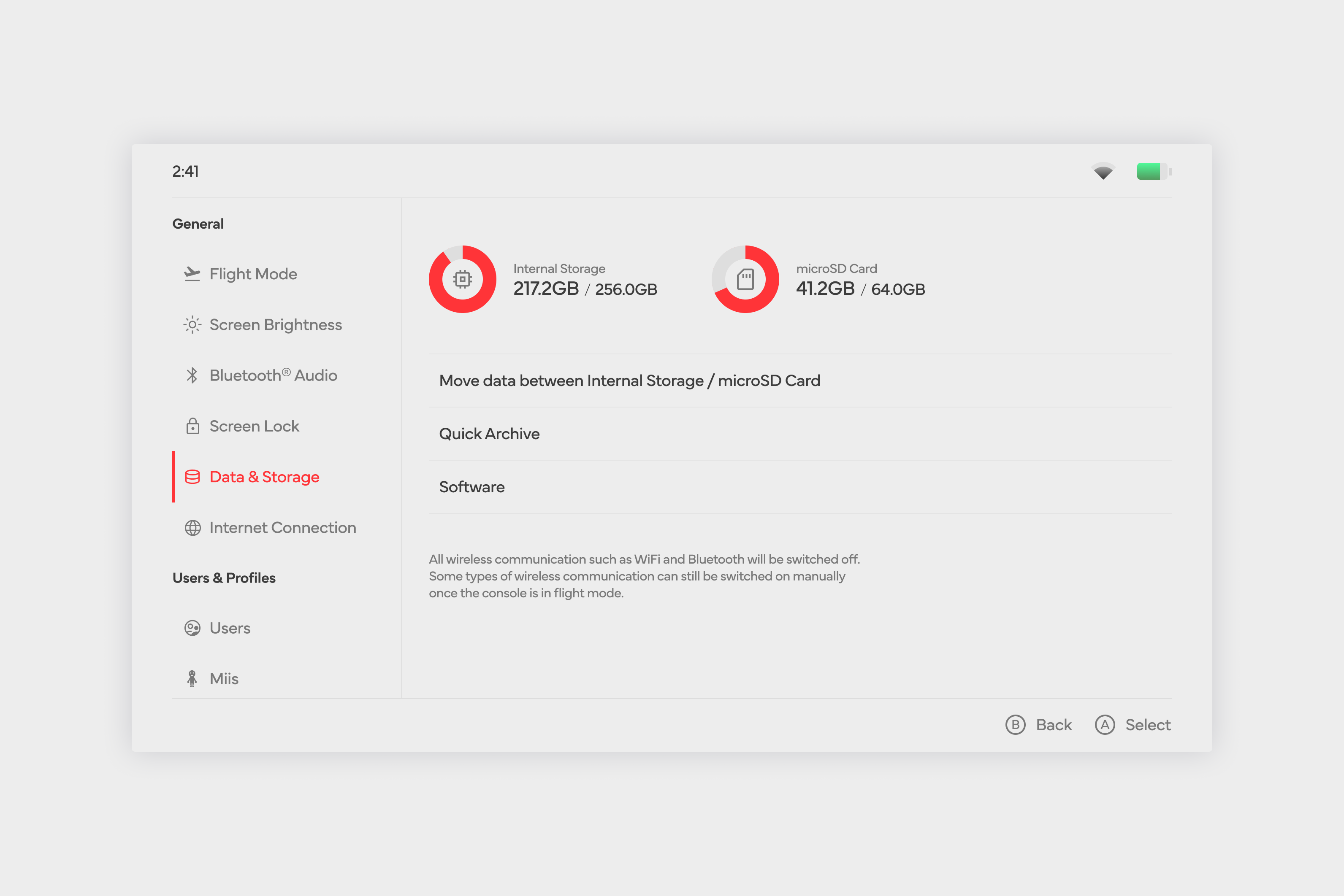
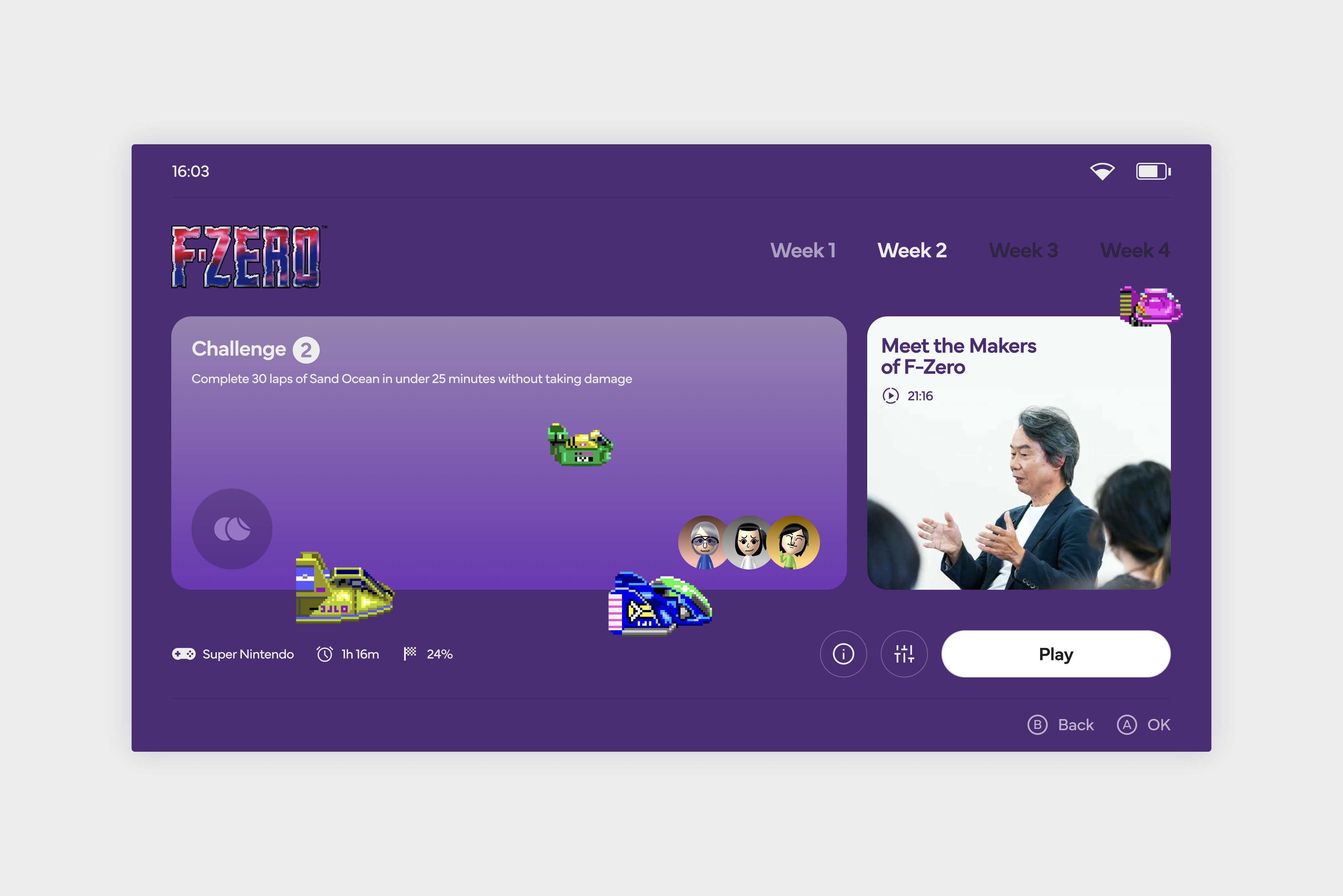
A very pretty example of exactly what I'm talking about is Dan Clarke's attempt at creating an entirely new Nintendo OS. A video games-centric designer by trade--we've covered Dan's stuff before!--this goes well beyond just mocking up a main dashboard, going into the tiniest detail on everything from fonts to icons to the battery display.
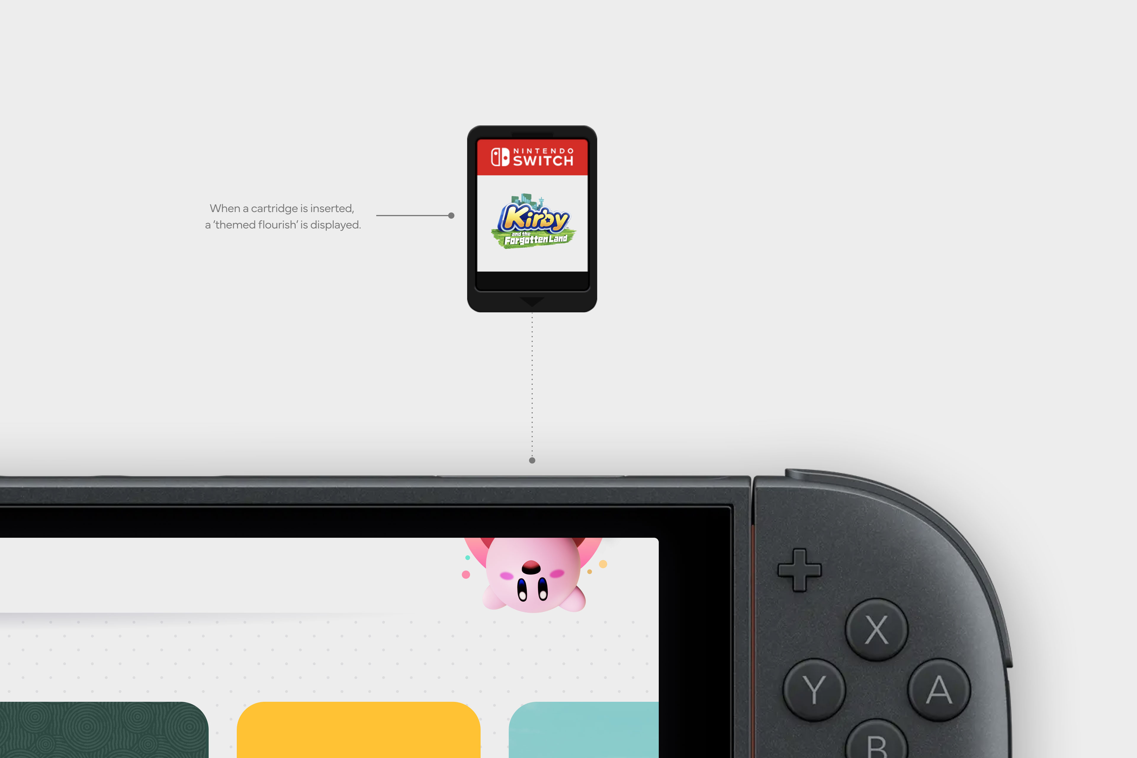
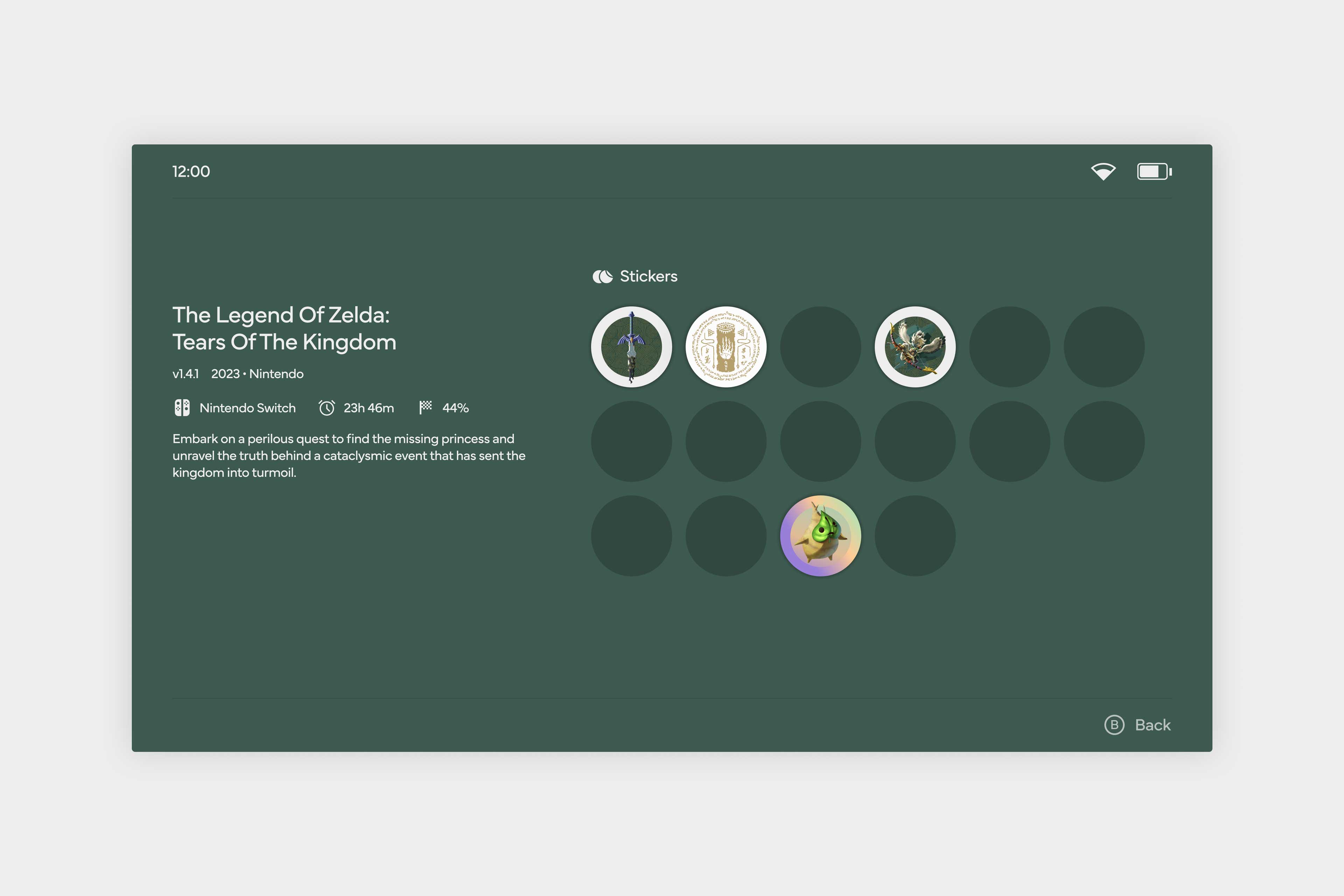
What I love about it is that it manages to nail both ends of the brief. Yes, it's clean and crisp in the way all modern interfaces must be for a serious company selling expensive hardware, but it also doesn't forget that Nintendo is a company built on fun, and so still has room for stuff like a cute little pop-up when you put the cartridge in, and a re-imagining of achievements as "stickers".
If you're a fiend for this stuff as much as I am, please go check out the full concept over on Dan's site; design sickos should know it includes everything from the colour palette to the percentages/dimensions for the layout of the home screen.