Last month I wrote about Blue Eye Samurai, an animated series on Netflix that, for multiple reasons, blew my socks clean off. It's a gripping tale of revenge with some truly memorable characters, but I'm not revisiting the show tonight to dwell on that. Tonight, we are feasting on the concept and character work behind the creation of Blue Eye Samurai's stunning visuals.
For this edition of Platform, our feature series showcasing the work of artists, I've spoken with three folks who worked on the show: lead character designer Brian Kesinger, production designer Jason Scheier and artist Abigail Larson, all involved in different areas of Blue Eye Samurai's world, all of who had some cool insights into being part of the show and all of whom were kind enough to share a ton of their work.
BRIAN KESINGER, lead character designer
Brian is an animation veteran of almost 30 years. After working in everything from visual development to layout, for Blue Eye Samurai he served as lead character designer, starting work in 2020.
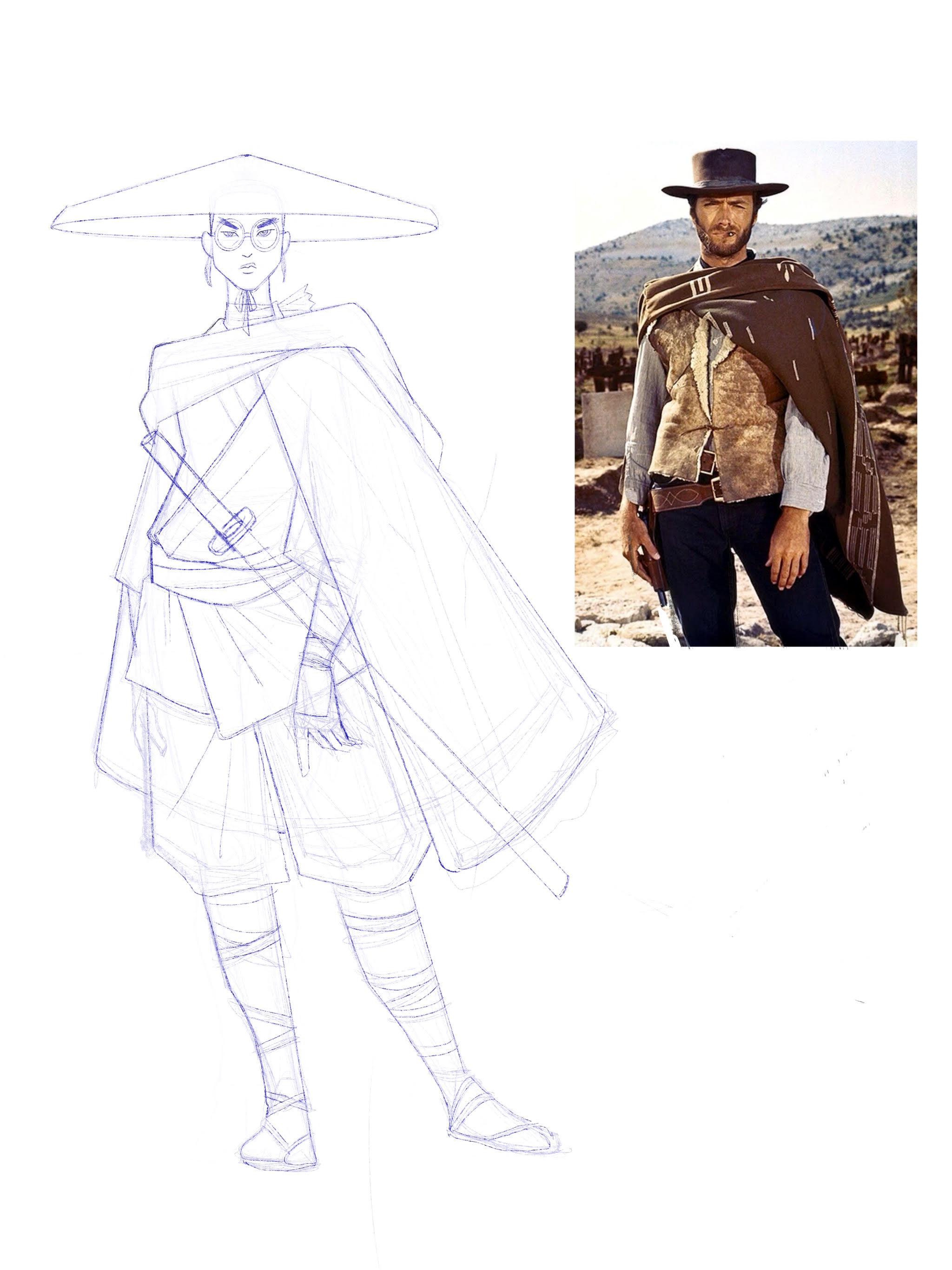
"Mizu and Swordfather were some of my favourite designs", Brian tells me. "I also really liked the bunraku puppets, those were overseen by one of my character artists, Julia Srednicki. As a department leader I enjoyed giving my artists projects within the show that they could take ownership of.”
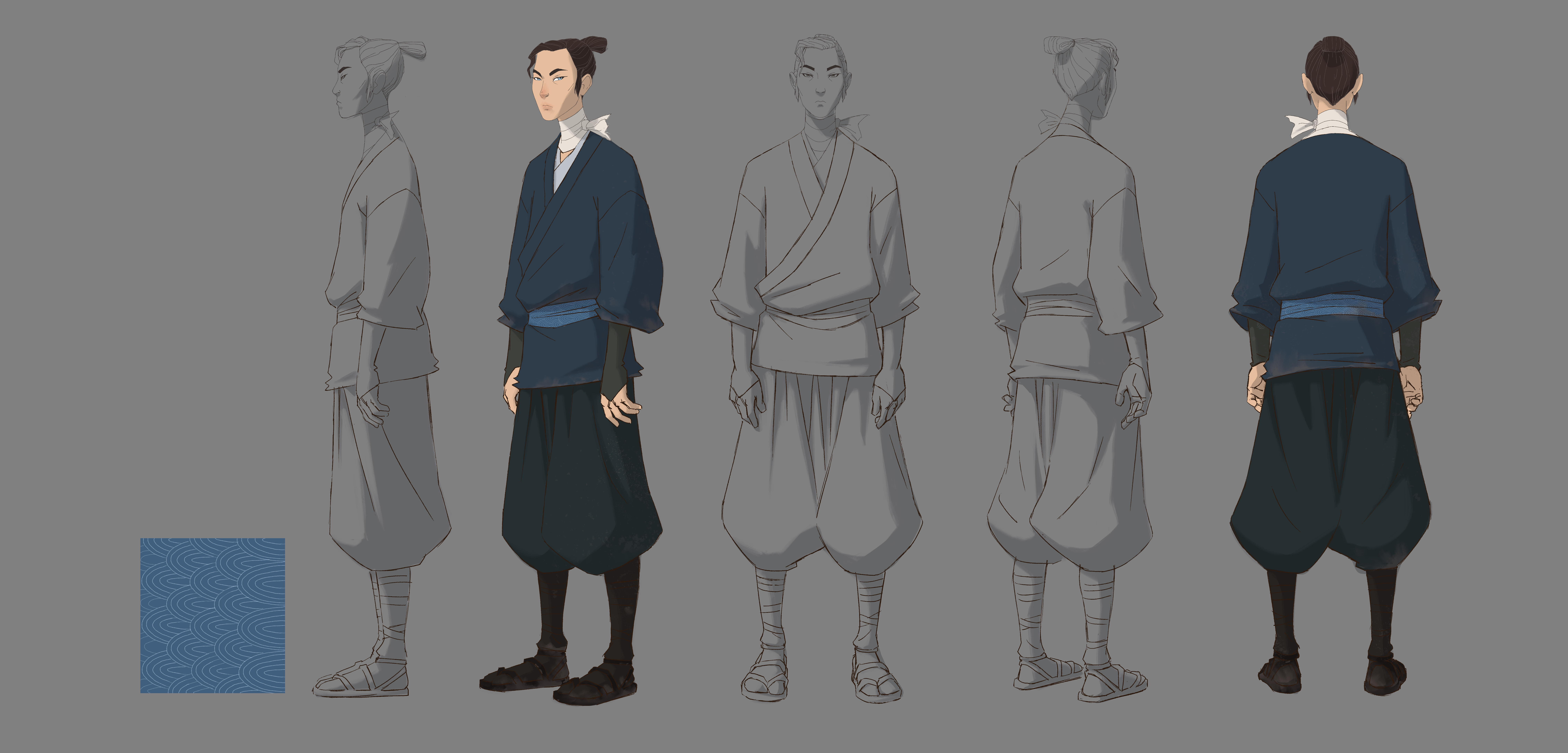
"From a design standpoint we were inspired by the line work of the ukiyo-e woodblock prints and a lot of historical research", Brian says. "Our supervising director Jane Wu has a background in fashion illustration so we also took some influences from that. Mostly in how we stretched the proportions of the characters to give them all a level of elegance. This was a story about a mixed-race character so we wanted the design to reflect that mix as well, so we would balance an eastern and western look anytime we could."
Because all I can think about after season one's finale was what season two could look like, I had to ask everyone if they had anything in mind for the look and feel of Mizu's continued adventures. "Not yet! However I am excited for the possibility to use our show style to design the people of [SPOILERS] (should Mizu actually make it there). That said there hasn’t been any official season two talks yet."
You can see more of Brian's work, and buy prints and other merch, at his personal website.
JASON SCHEIER, production designer
Jason Scheier has been working in animation since 2007, and his credits appear in work such as How To Train Your Dragon, The Croods and Kung Fu Panda. He's also done video game stuff, including a stint at EA working on the Battlefield series.
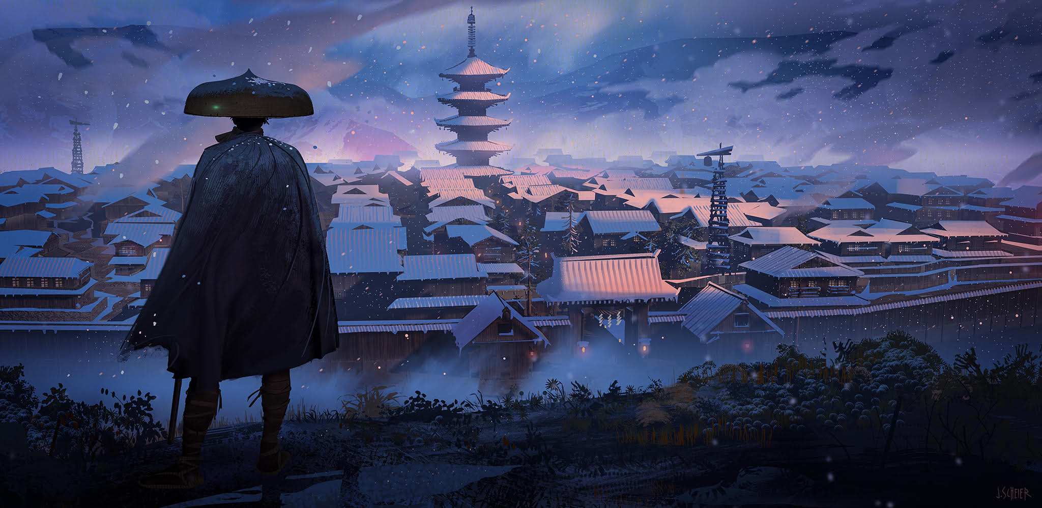
Scheier was production designer on Blue Eye Samurai. "I began working on Blue Eye Samurai in early 2020, right when the world shut down during the pandemic", he says. "I was the first Art Department hire, and went on to hire many of the Character Designers, Visual Development Artists, and 3D modeling team".
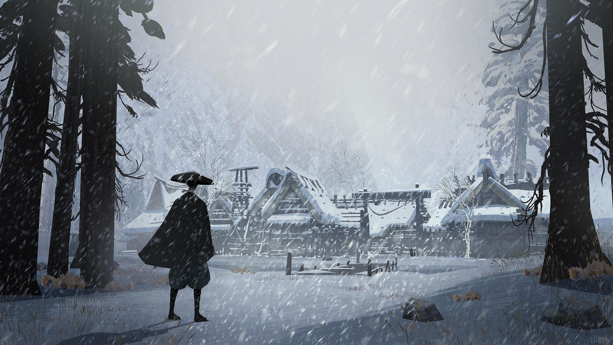
"It's important to note I left the show after about a year and a half, and another Production Designer came on board to finish out the show [Ed's note: this was Toby Wilson]. However, almost every location and set was designed while I was aboard, and even our main characters were already developed. I even helped launch our vendor Studio Blue Spirit on a few episodes, as well as find the style for the characters and sets for the show along with our amazing team. My reason for leaving is a story for another day [smiles]".
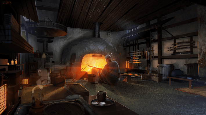
"My favorite work for the production was when I designed the Soba House, the Arashiyama Forest Shrine, and the Swordfather's Forge", Scheier tells me. "Those three locations were the very first designed for the show, I knew it would lay the foundation for how the style of the sets would develop. For example, the Soba House would be the location we would later use to find our animation partner or vendor. This meant it would need to be packed with detail that we could test our potential vendor with handling the subtle details and nuances of the show. At that point, I was working closely with our supervising director Jane Wu, and our showrunners and creators Michael Green and Amber Noizumi to find ways to inject storytelling of the sets into those locations."
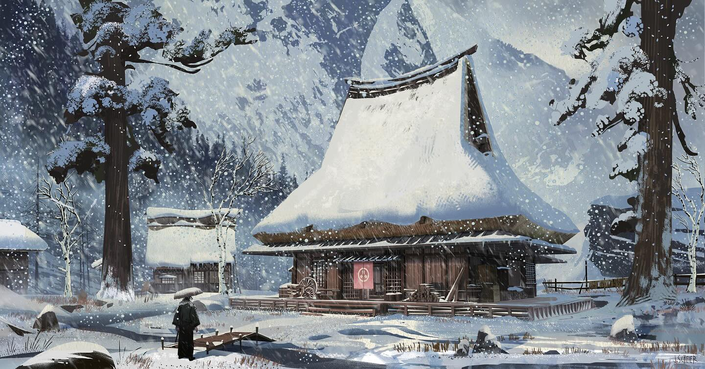
"The Soba house was critical, because the staging was so specific where Mizu started her journey. I put the traditional sunken hearth fireplace (Irori) at the center of the room much like homes during the Edo period. The space was described to me by our director as our version of a saloon. The phrase east meets west was used occasionally to emphasize the world. When we first meet Mizu, the world needed to feel used and worn down; humble in its origin much like Ringo, who worked there with his father selling Soba to the locals in Komatsu village. I wanted the set to tell a story that existed beyond the frame. Many of our visual development artists I would hire would help package up signage, chopsticks, and even tatami mats on the floor needed to tell a story. If you see the diagonal design of the room to make sure there was always an eyeline between the character Hatchi and Mizu as the confrontation unfurls."
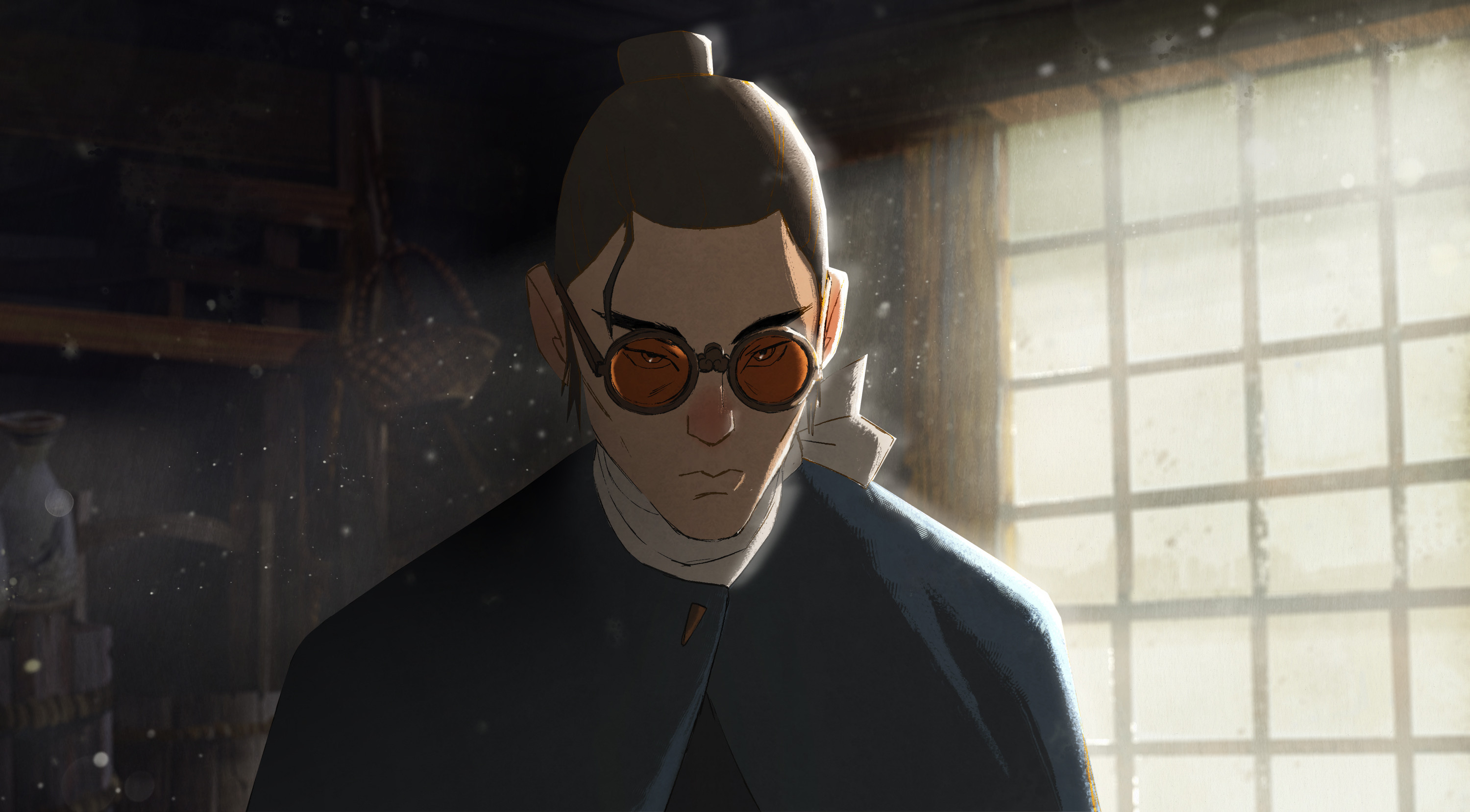
"My personal influences when beginning to craft the visuals for the show were artists like Kiyoshi Saito, who did beautiful woodblock paintings, Hiroshi Yoshida, Tsuchiya Koitsu, and that's on the art side. For film influences, Akira Kurosawa, Once upon a time in the West, Lady Snowblood, Hateful 8, 13 Assassins, and even Samurai Champloo."
You can see more of Scheier's work, including loads more Blue Eye Samurai stuff, at his personal website.
ABIGAIL LARSON, artist
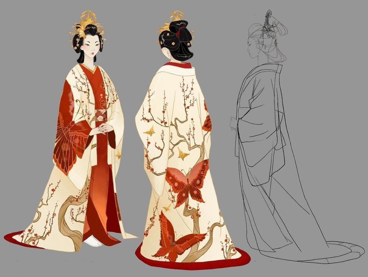
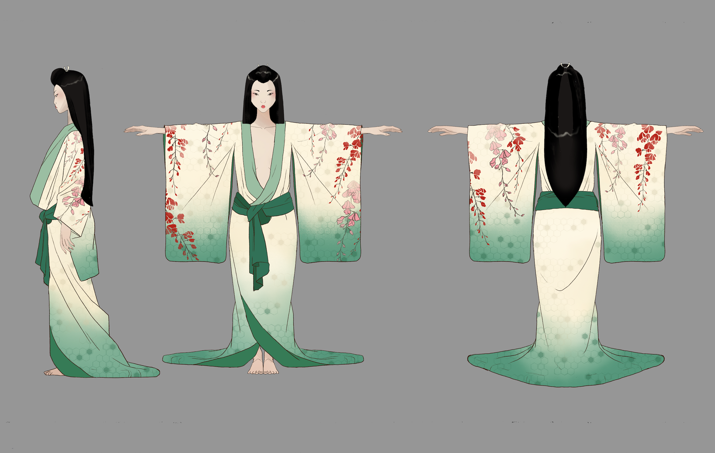
Abigail Larson is a freelance illustrator, perhaps best known for her work in books and comics (on stuff like The Nightmare Before Christmas Tarot, Sandman and Disney's Cautionary Tales). "I was brought onto the Blue Eye Samurai team by Brian Kesigner and Jane Wu, who both thought my drawing style worked well for the show", Larson tells me. "We knew going in that we wanted our characters to mimic fashion illustration and traditional Bunraku puppets, so I think my angular illustrative style was a good fit."
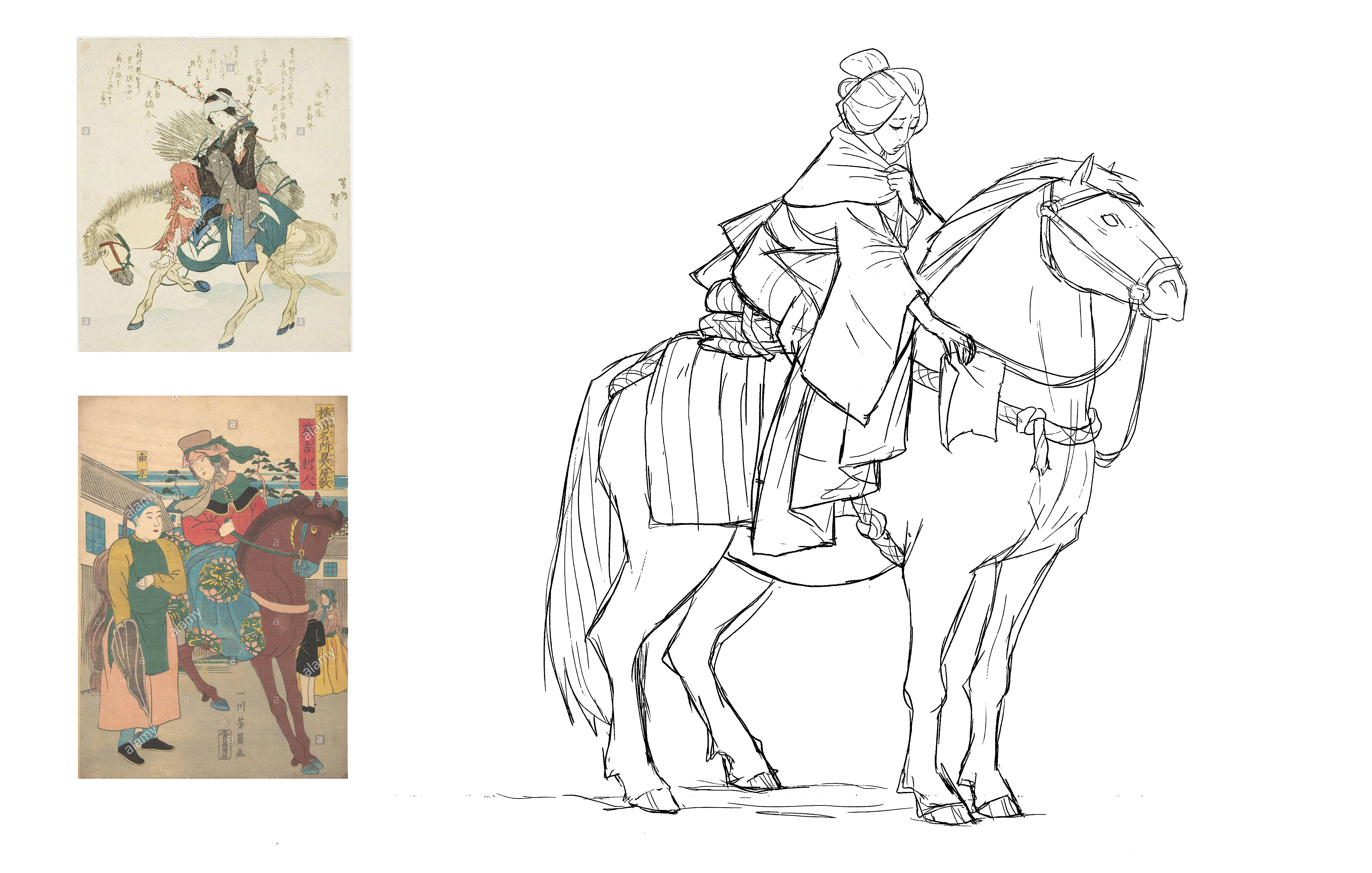
Larson's first job on Blue Eye Samurai was also her favourite. "My first assignment was to draw Princess Akemi," she says. "I helped hone her final design, and all her outfits and accessories. It was just so much fun diving into the world of Edo Japan and researching the highest fashion at that time - I was allowed and encouraged to really push Akemi's fashion sense and make her outfits evolve symbolically with her character arc. It was wonderful."
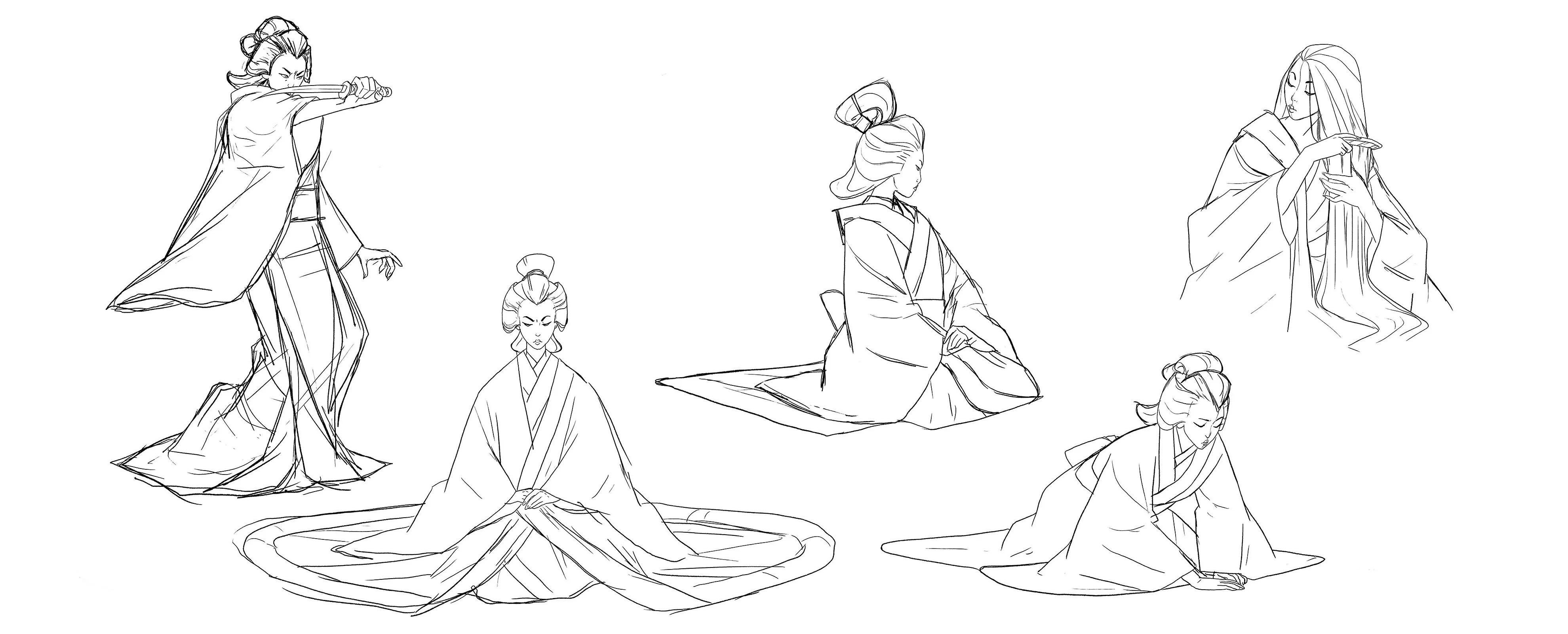
When it comes to her biggest inspirations for her work on the series, Larson says she was able to rewatch some old samurai favourites like Harakiri, Kwaidan, Twilight Samurai and Zatoichi. She says the team also took very close notes studying 1987's Genji Monogatari, "which we watched specifically to study animated movement in traditional clothing".
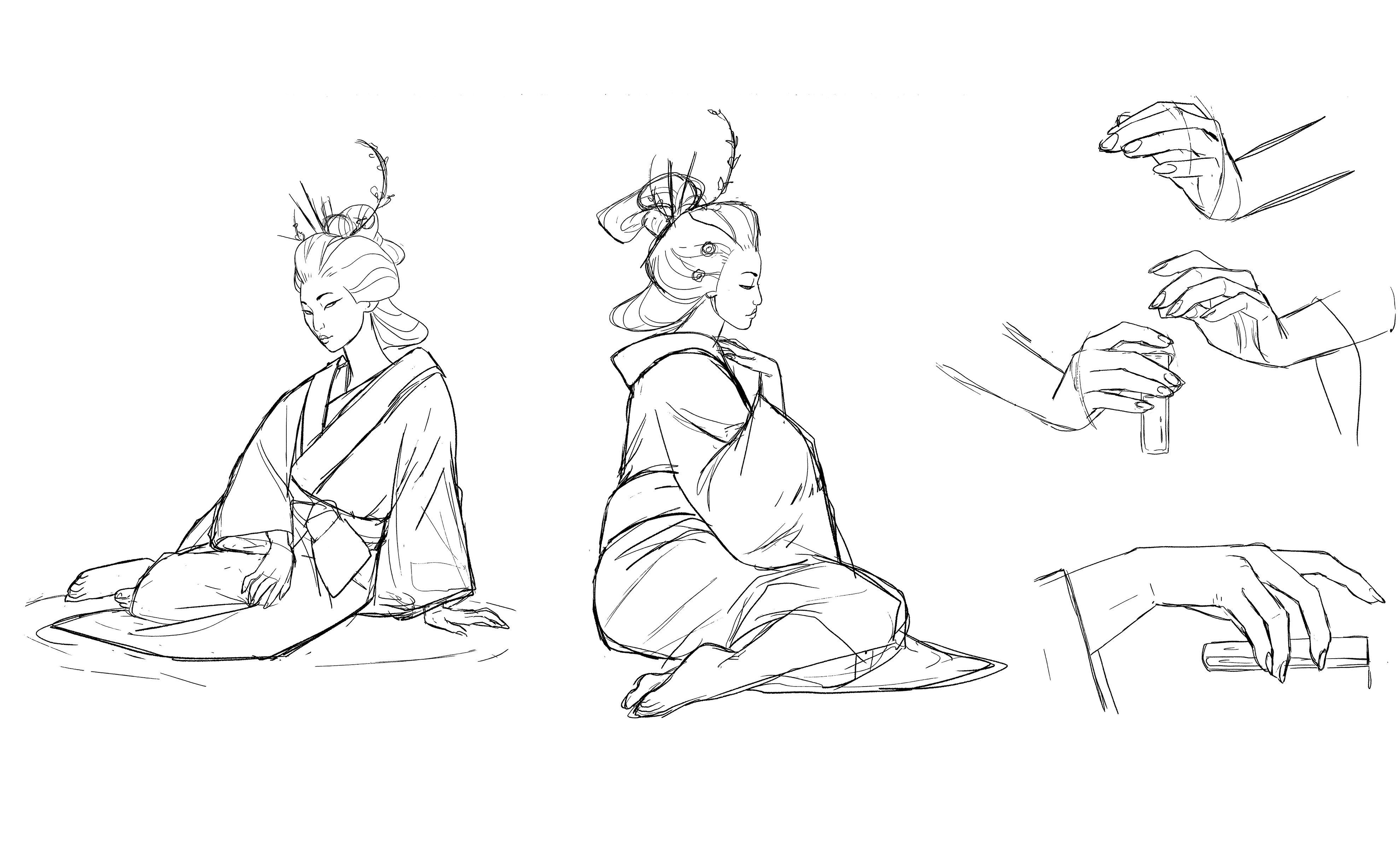
“For [most of] my assignments dealing with clothing, though, my biggest source of inspiration was studying museum archives. I relied heavily on the MET's online catalog of Edo period kimonos and uchikake for inspiration.”
You can see more of Larson's work, and buy prints, at her personal site.
'Showcase' is a feature highlighting the work of artists in and around the video game industry. You can see more, for stuff like Homeworld 3, Wild Bastards and beyond, here:


