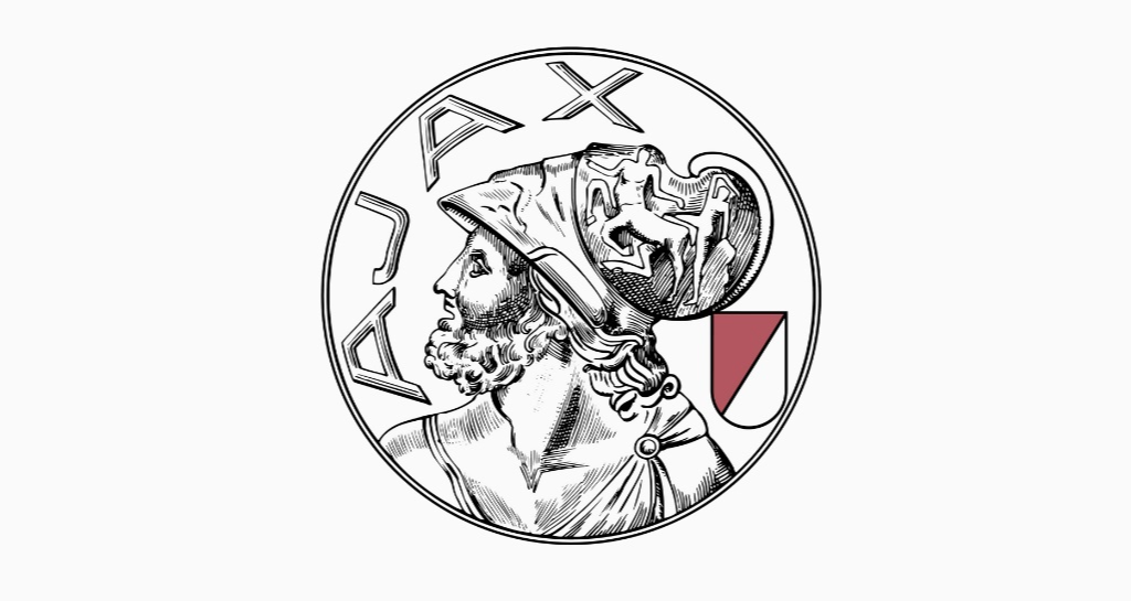
Ajax, the most famous and successful club in Dutch football, have this week changed their logo (usually called a badge or crest in football) for the first time since 1991. The old one--a stylised depiction of the Greek hero Ajax made up of 11 individual lines to symbolise the 11 players on the field, and which you can see above--was great, so the news that the club was replacing it was enough to send a chill through the spines of fans the world over.
Why? Because over the last decade or two a number of proud, old football clubs across Europe have changed their badges, swapping out storied and traditional branding for minimalist logos that look more like insurance companies. I'm not here to armchair the entire field of graphic design; companies and organisations and even countries always need a new look from time to time. But in the world of football, nearly every single one of these rebrands has ended up being a downgrade for reasons far beyond the visual.

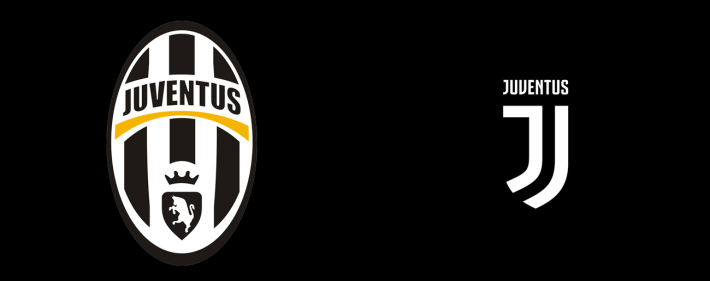
This creates problems! Fans are often unhappy at any change to their traditions, let alone ones inspired by things like "modernity" and "commercial interests", but some of these attempts--Juventus' in particular--made people really unhappy. Sometimes fans get so unhappy that, in cases like Leeds in 2018, the club is forced to scarp the redesign altogether.
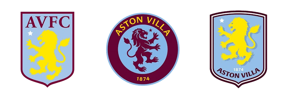
For another example closer to my own heart, Aston Villa have been through three badges in three seasons (below) after the one on the left was replaced by the one in the middle, supposedly after fan consultation, but fans didn't really like it (and everyone else said it looked too much like Chelsea), so for this season it was changed again by...basically reverting to the older one and just making a few border changes.

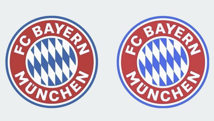
So you can't blame other clubs, like Bayern Munich (below), from being so adverse to any radical changes that when it comes time to modernise their badge they simply make the slightest tweak imaginable (in this case just a few colour changes, which depending on the screen you're reading this on might not even be visible).

Thankfully, Ajax have decided to buck this trend, introducing a new badge (below) that instead of being less detailed is significantly more so, fleshing out our tragic hero and son of King Telamon in a way that makes the crest look like a coin that has just been uncovered by a team of archaeologists. Which is fitting, because the badge is old; it's essentially a rebirth of Ajax's branding from 1928-1991, less of an exercise in reinventing the club, more about going back to their roots.

I love it! And more importantly, their fans seem to love it too; for a club based on a classical hero, that's over 100 years old and has a long legacy of success, a classical badge makes sense! This has been a great and rare triumph in modern football branding, and is something that other fields--I'm looking at you, fashion, with your endemic "blanding"--might do well to remember as well.
Modernising and simplifying a logo might sound like a great idea across a boardroom table, but when the thing you're rebranding isn't just old as hell, but also means a great deal to average people, you don't always need to look forwards to find a fresh look.


![GameStop Wants To Buy, Uh, eBay? [Update]](https://storage.ghost.io/c/30/f5/30f5b1bb-84ee-4c26-b446-fb9a5e512994/content/images/size/w30/2026/05/Untitled-3.jpg)

